How to Build a No-Shoot Shopify Photo Workflow That Still Looks Premium
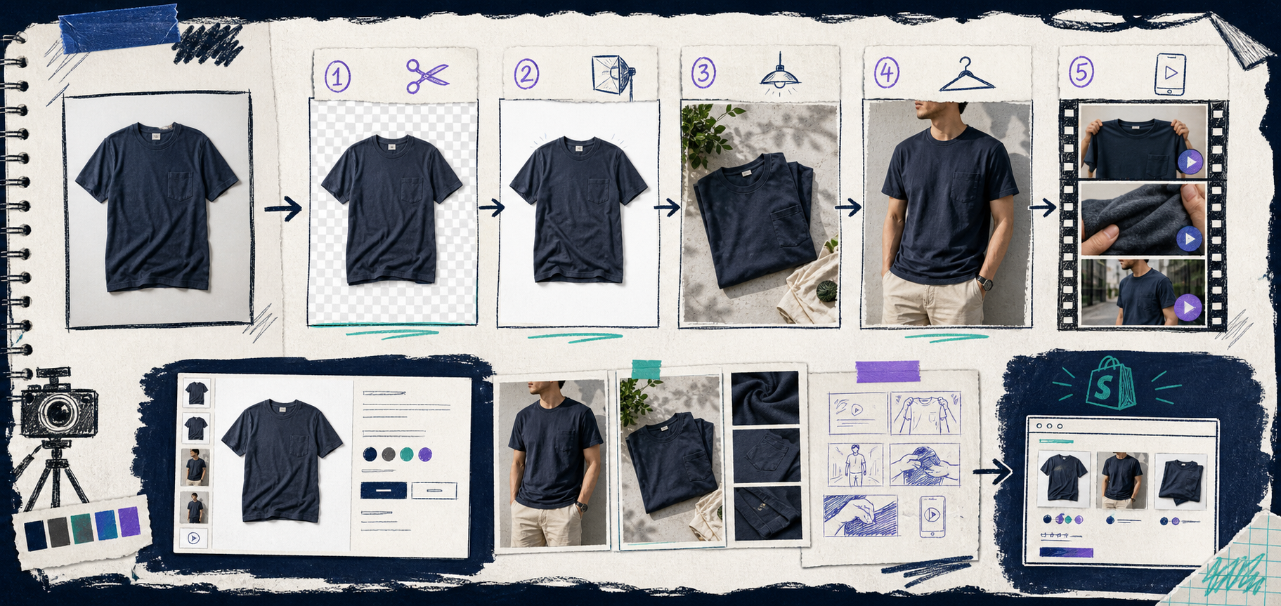
I keep seeing the same failure mode in Shopify stores: the product is fine, but the photography stops at “good enough.” One clean shot goes live, then the store needs a lifestyle image, a model image, a better hero crop, and a few ad-ready clips. That is where the visual work starts to feel expensive.
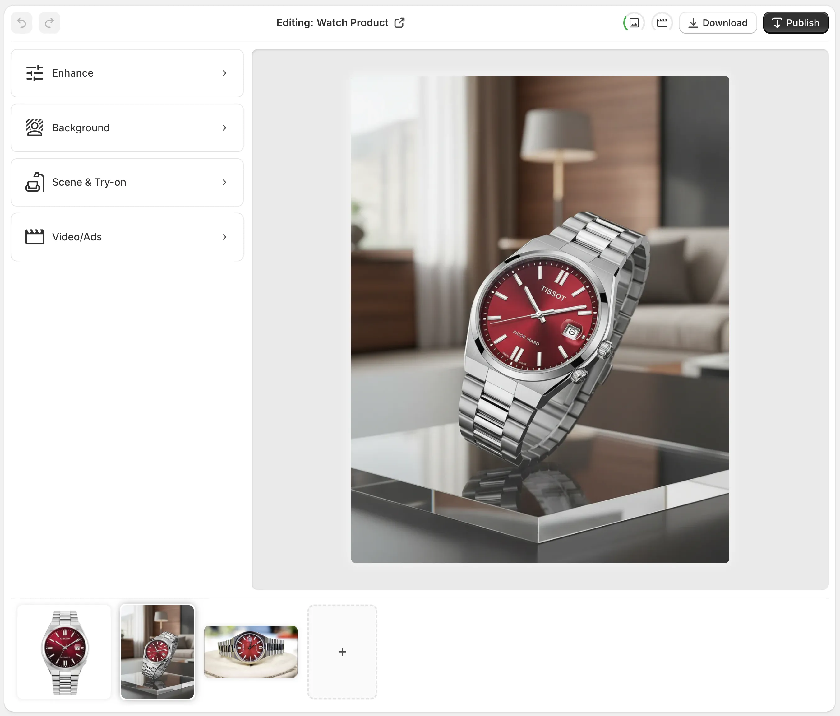
The practical fix I reached for is Supra AI Photo Studio, with the landing page as the quick tour and the demo trailer if you want to see it in motion. The app is built for exactly this middle ground: a decent source photo that needs to become a full visual kit without hiring a photographer every time.
Start With The Photo You Already Have
I do not start by trying to invent a perfect brand scene. I start with the plain product photo that already exists in Shopify or in the supplier folder. That matters because most stores do not need a total reinvention. They need a cleaner version of the same product, then a few variations that fit different placements.
Supra AI Photo Studio gives you the boring-but-important tools first: background removal, upscaling, and auto-enhance for denoise, deblur, color, and lighting. That is the base layer. If the original image is fuzzy, badly lit, or floating on a distracting background, the whole workflow gets harder later.
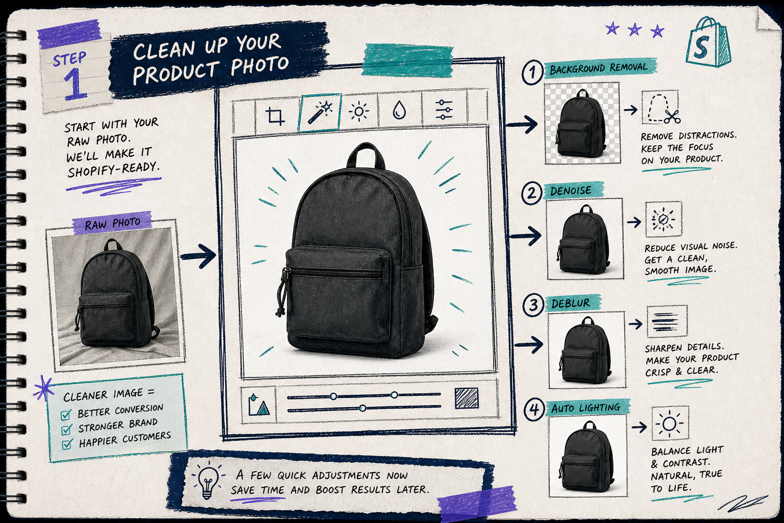
My rule is simple: clean the source shot before you ask for anything creative. If the cutout is bad, every lifestyle scene will inherit the problem. If the lighting is weak, every generated variation will look slightly off. Once the base image is stable, the rest of the workflow becomes much easier to trust.
Build One Lifestyle Scene Before You Build Ten
The fastest way to waste time is to generate too many versions too early. I prefer one strong lifestyle scene first. That gives me a visual anchor for the product page and a reference for the rest of the assets.
This is where the app’s object placement feature is useful. You can place the product in a studio, a luxury boutique, a natural setting, or another environment that matches the product story. If I am working with a skincare item, a shelf or vanity setup usually works. If I am working with a home accessory, a tabletop scene or room detail shot is a better fit.
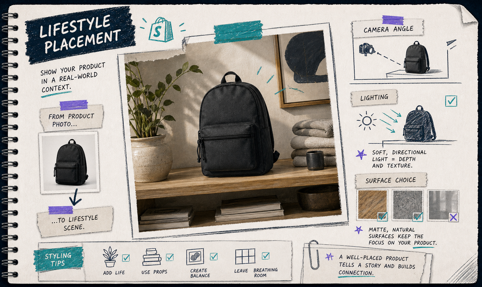
I like this step because it forces a decision. Either the product belongs in a minimal catalog-style environment, or it belongs in a richer scene with context. You do not need to force both at once. Pick the one that makes the offer easier to understand, then reuse that visual language elsewhere.
If you want more examples of that “one photo into more than one asset” approach, these older writeups are the right companions: How to Turn One Product Photo Into Listings, Lifestyle Shots, and Ads, How to Turn One Product Photo Into Studio-Ready Shopify Assets, and How to Keep Shopify Product Photos Consistent Across Your Catalog.
Use Try-On Only Where It Actually Helps
The try-on feature is the most obvious headline feature, but I only use it when the product type benefits from a human context. Apparel, jewelry, and accessories are the obvious cases. A model gives the product scale, fit, and styling cues that a flat shot cannot.
The key is not to make the try-on scene louder than the product. I want the customer to notice the item first and the model second. That is why I keep the scene restrained and let the product stay visually dominant.
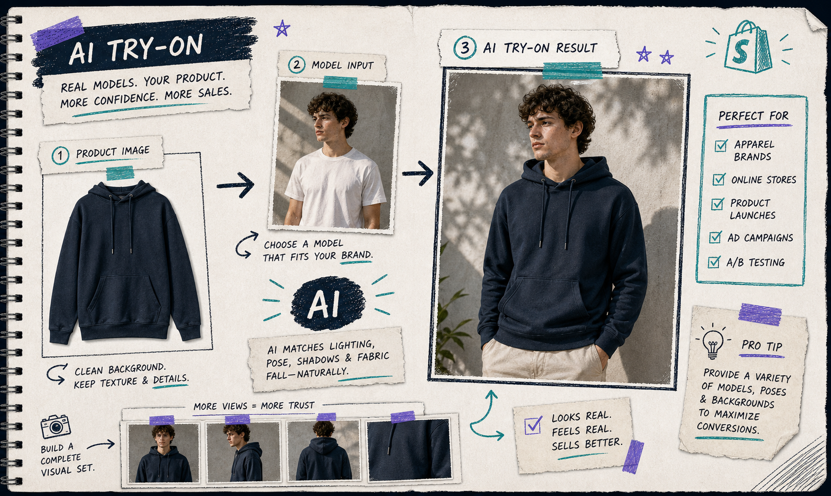
When the model choice is strong, the whole storefront feels more coherent. When it is weak, the image becomes another thing the buyer has to ignore. I treat try-on as a conversion tool, not a special effect.
Turn The Same Photo Into Ad Creative
Once the still assets are solid, I move to motion. Supra AI Photo Studio can generate UGC videos and b-roll videos, which is useful when the store needs ad variations faster than a manual edit queue can handle.
I do not ask the motion output to solve a branding problem. I ask it to extend a good product photo into short, usable clips for ads, social, and retargeting. That keeps the creative consistent with the still images instead of drifting into a separate visual style.
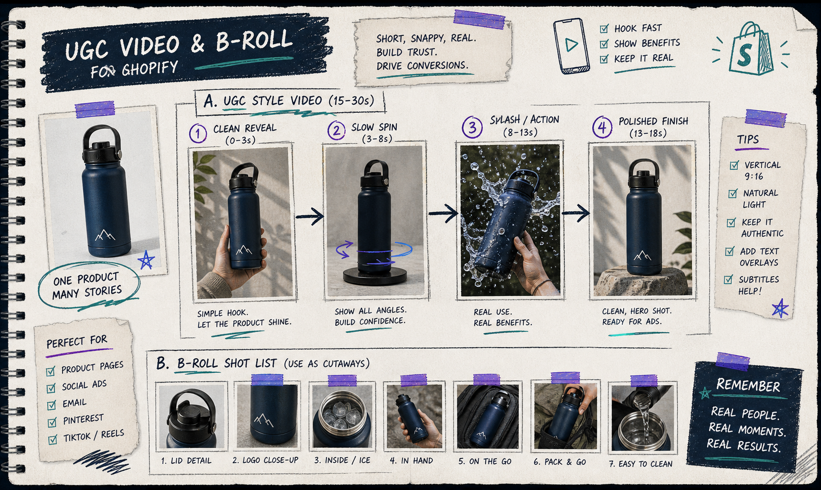
If you already know you need more motion after the still-photo pass, the related article How to Create UGC-Style Product Videos for Shopify Without Hiring Influencers is the obvious next stop.
The Checklist I Use Before I Call It Done
Before I treat the visual set as finished, I check for five things:
- The base shot is clean enough to crop and reuse.
- The product still looks like the same product in every variation.
- The lifestyle scene matches the store’s tone.
- The try-on image helps the buyer understand fit, scale, or style.
- The ad clip looks like a sibling asset, not a separate campaign.
That last point matters more than it sounds. The win is not just making one pretty image. The win is making a set of images and clips that feel like they belong together on the product page, in the ad account, and in the email flow.
If you want to see the app workflow itself, the editor overview help screen is useful because it shows how the top bar, tools, canvas, and gallery fit together.
Bottom Line
I like this kind of workflow because it keeps the store moving without forcing a reshoot every time the marketing plan changes. One decent product photo becomes a cleaner cutout, a lifestyle version, a try-on version, and a motion asset set. That is enough to make the store feel much more intentional.
If you want to try it, start with the Shopify app listing, open the landing page, and build one premium-looking set from a single source image before you try to automate the whole catalog.