How to Set Up Shopify Swatches From Product Images and Variants
If your product cards still make shoppers click dropdowns just to pick a color or finish, this is the kind of change that pays back quickly. A good swatch setup makes the catalog easier to scan, keeps the theme simple, and avoids a bunch of hand-built exceptions later.
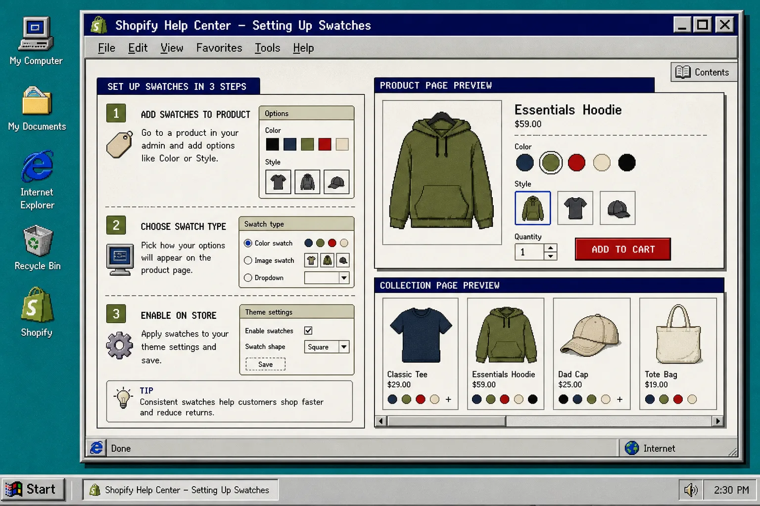
I usually start with Supra Swatch Colors because it handles variant swatches, linked products, and collection pages without code. It also lets you auto-detect colors or use product images when that is the faster path. The goal is not to make the store look busy. The goal is to make the choice obvious.
1. Decide whether the choice belongs to one product or several
Start with structure, not styling.
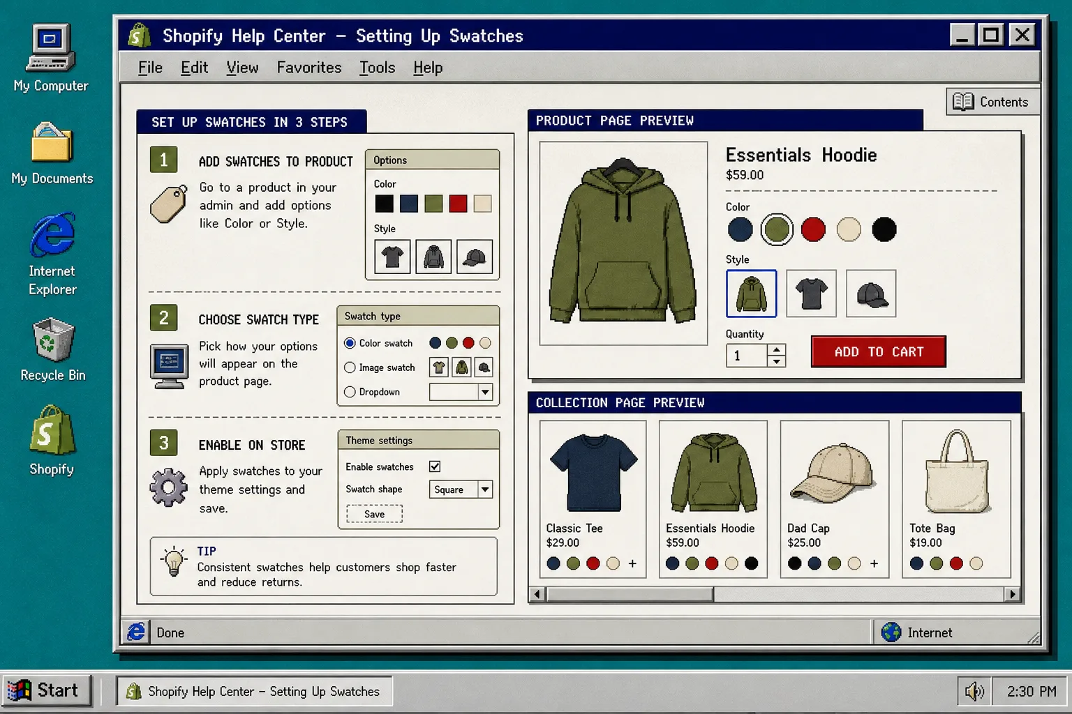
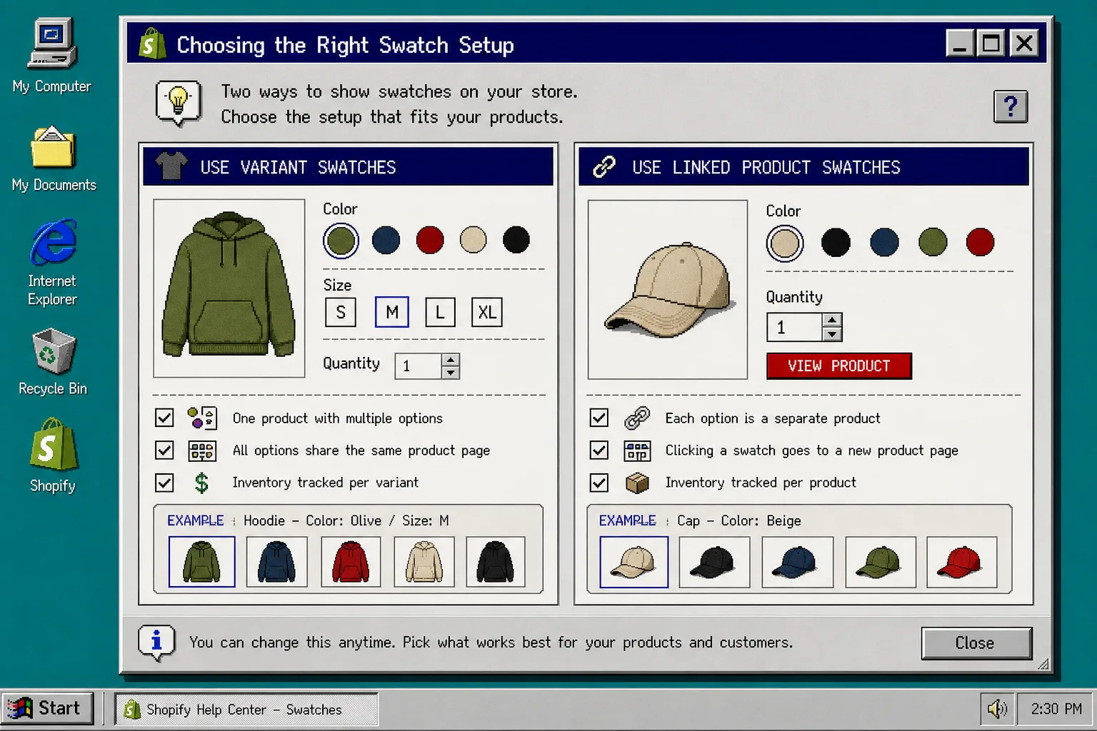
Use variant swatches when the customer is choosing between options that belong on one product page. That is the right move for sizes, colors, and finish options that share the same listing.
Use linked-product swatches when each choice should open a separate product page. That is better when the photos change, the inventory is separate, or the copy needs to be different for each item.
This is the same decision I cover in How I Decide Whether Shopify Swatches Should Be Variants or Linked Products. Make that call first, then build the swatch layer around it.
2. Build the swatches from the cleanest source you already have
If your option names are already tidy, use color swatches and let the app auto-detect the palette. If your catalog uses textures, patterns, or product-specific imagery, use image swatches instead. The second approach is especially useful when the customer needs to see the material, not just the label.
That is the part I like most about this setup: it lets you use the data you already have instead of inventing a new workflow. You do not need a separate design pass for every item.
If you want the walkthrough that shows the app setup flow itself, the Getting Started tutorial is the best companion video.
3. Tune the style before you spread it across the catalog
Do not treat the first swatch layout as final.
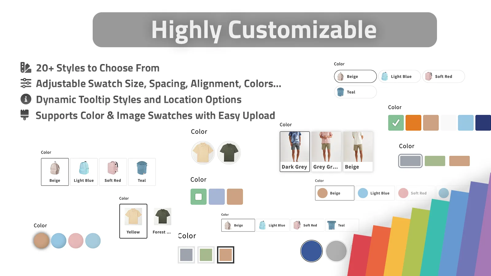
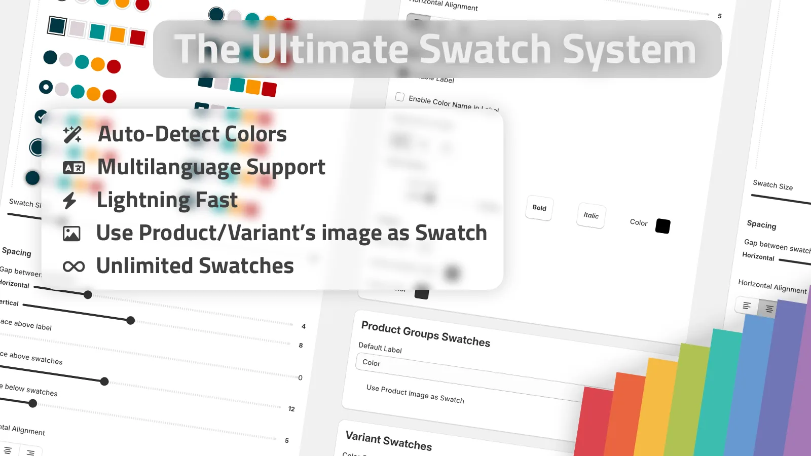
Set the swatch size, shape, tooltip, and label so the controls read like part of the theme. The app gives you more than 20 styles, so you usually only need a light touch: a smaller swatch, a clearer tooltip, or a shape that matches the rest of the product UI.
That matters because the best swatch setup is the one that disappears into the page. It should make the choice easier, not turn itself into a visual headline.
For a good comparison point, I would also read How I Build Shopify Swatches That Match the Theme and How I Chose a Shopify Swatch App for Variants, Linked Products, and Collections.
4. Turn on collection pages after product pages are stable
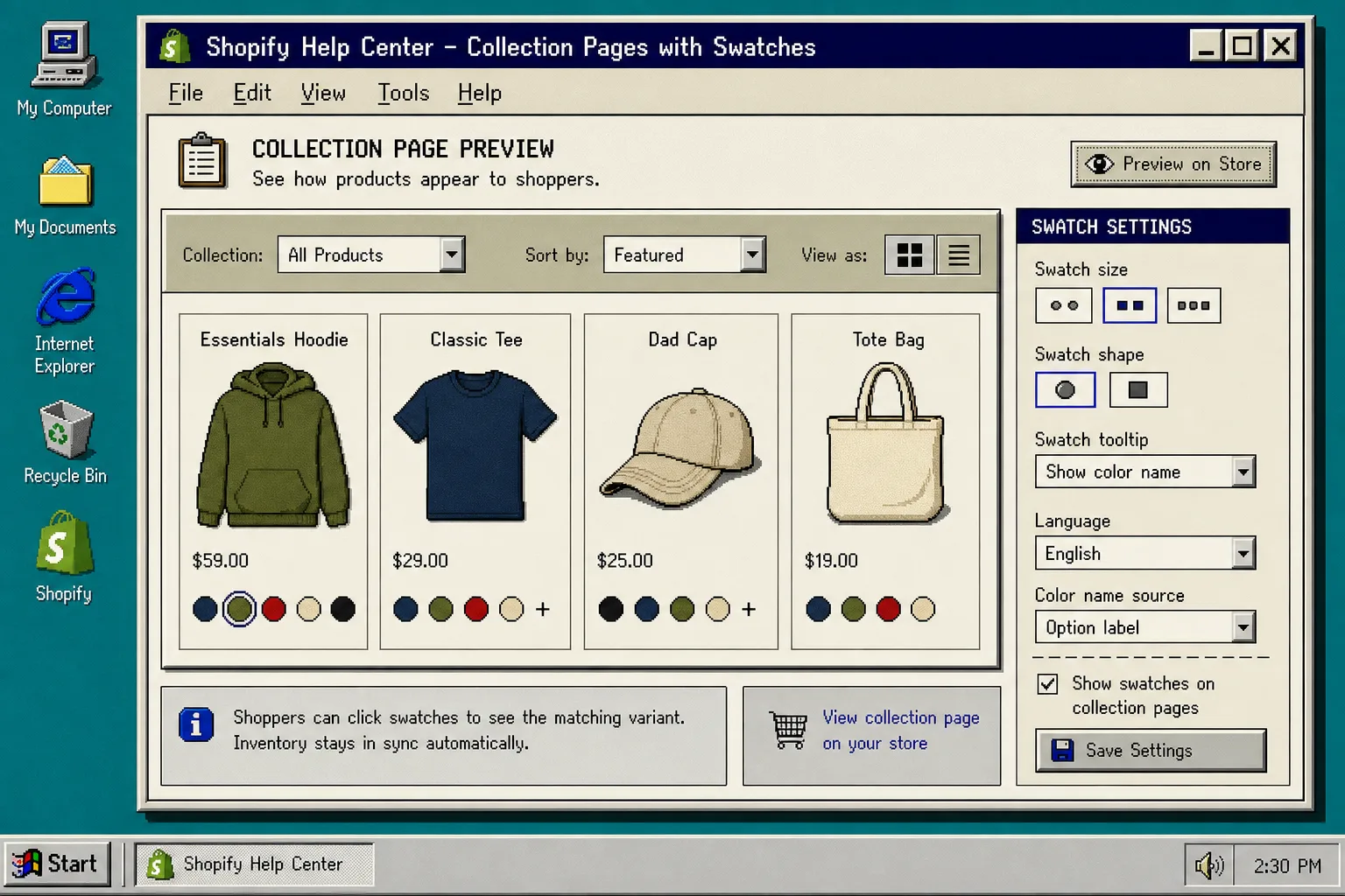
Once the product page looks right, extend the same setup to collection pages.
This is the part that makes the catalog feel easier to browse. Shoppers can compare options without opening every listing, and the grid stays readable because the swatches sit right where the decision happens.
The good part is that Supra Swatch Colors supports collection pages built in, so you do not have to patch theme code just to get the visual cue in the grid. That keeps the rollout simpler, and it makes future theme changes less risky.
If your store has a lot of translated content or a larger catalog, How to Scale Shopify Swatches for Large, Multilingual Catalogs is the next article I would read. The main thing is to verify that the same swatch logic still reads cleanly in every language.
5. Check the edge cases before you ship it
Before you publish, test the messy cases:
- products whose color names do not match exactly;
- linked-product groups with very similar thumbnails;
- swatch labels that get too long in smaller sizes;
- collection pages that show too many choices at once;
- translated stores where the label changes but the swatch mapping should not.
If a swatch fails to show up, check the data source first. In most cases the problem is not the visual style. It is the mapping between the option name, the product group, and the page template.
If you still want a broader framework for deciding what belongs in the setup, How I Decide Whether Shopify Swatches Should Be Variants or Linked Products is the right checkpoint.
Troubleshooting
- If only some colors appear, normalize the option names before you keep styling the page.
- If collection swatches look crowded, reduce the visible size or limit the number shown at once.
- If the swatches feel disconnected from the theme, simplify the shape and tooltip first.
- If you are unsure whether to use linked products or variants, make that decision before you adjust design settings.
The practical rule is simple: use variant swatches when the product is one item, use linked-product swatches when the choice is really a different product, and turn on collection pages only after the product page is stable.
If you want to try the same setup, install Supra Swatch Colors and follow the getting started tutorial. That gives you the fastest path from dropdowns to a swatch system that is easier to scan, easier to maintain, and easier to extend later.