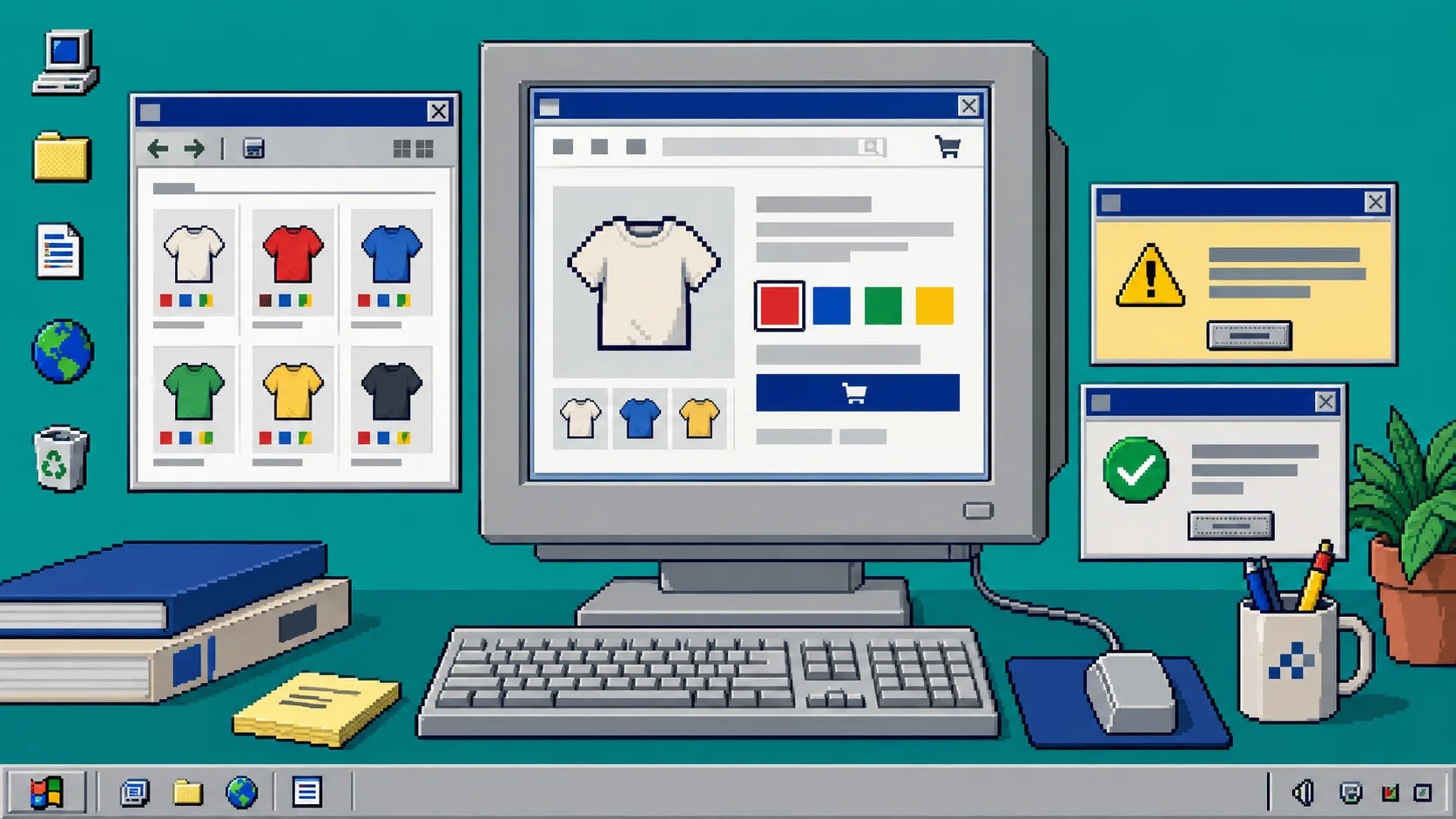
Your shoppers should be able to choose a color without wondering whether it is a variant, a separate product, or a missing option. This guide sets up one dependable swatch workflow for Shopify product pages and collection pages. You need access to your Shopify admin, a published theme, and Supra Swatch Colors. No theme-code editing is required.
Before You Start
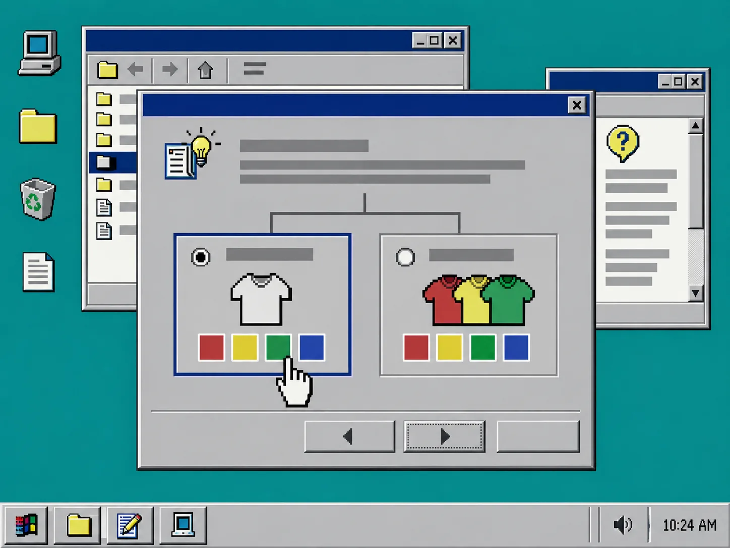
Decide what a color represents in your catalog. A single product with sizes and colors usually needs variant swatches. Separate product pages for each color usually need linked-product swatches. Mixing those models for the same product family is the most common reason a color picker feels inconsistent. If you are still deciding, see how to link separate Shopify products with color swatches for the linked-product case.
1. Install the Swatch Tool
Install Supra Swatch Colors from the Shopify App Store, then open the app from Shopify admin > Apps. Confirm that the app can see the products and theme you intend to use.
You should see the app settings rather than an unfinished Shopify installation screen. Keep one browser tab open on a representative product and another on the collection that contains it. Those two tabs become your test bench.
2. Choose One Color Model Per Product Family
Open a product family and inspect its Shopify options.
- Use variant colors when the shopper should stay on one product page while changing color. Keep color values consistent: use
Navyeverywhere, notNavy,Dark Navy, andBlue Navyfor the same shade. - Use linked products when each color has its own product page, inventory story, photographs, or URL. Group the sibling products in Supra Swatch Colors and give each linked product its matching swatch.
- Avoid creating a linked-product group on top of color variants for the same buying decision. Pick the representation that matches your catalog.
This is also a good moment to standardize size charts. A shared chart can be assigned at collection level; see how to assign one Shopify size chart to a whole collection if your color family is apparel.
3. Create the Swatches
In Supra Swatch Colors, select the color option or product group you chose in the previous step. Let the app auto-detect existing colors when those names are clear, then correct any ambiguous colors manually. For patterned or textured choices, use an image swatch from the appropriate product image instead of pretending every option is a flat color.
Set the swatch shape, size, label, and tooltip once for the family. The app supports more than 20 styles, so the practical rule is simple: make a small swatch easy to scan, but leave enough contrast that a white, cream, or pale-yellow selection does not disappear into the page.
4. Enable Both Storefront Locations
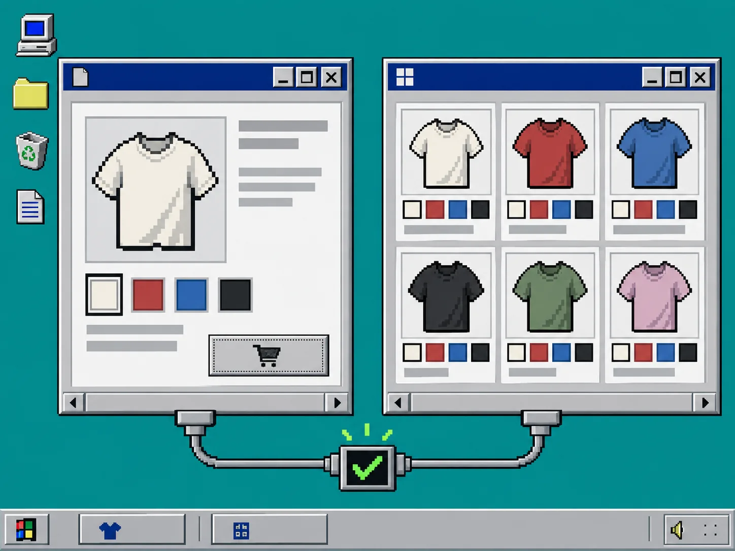
Turn on the product-page placement first. Preview a product, select two different colors, and confirm that the selected state changes and the correct variant or linked product opens.
Next, enable collection-page swatches in the app. Supra Swatch Colors supports collection-page swatches without code, but that does not remove the need to check your own theme. Open the representative collection and confirm the swatches appear on more than one card, including a product with an unavailable color if your store has one. For a focused collection-page walkthrough, use how to add swatches on the collection pages of your Shopify store.
What you should see: the same colors, swatch treatment, and selection behavior that you tested on the product page.
5. Test the Shopper Path
Run this short test in a private browser window.
- Open a collection page.
- Choose a color on a product card.
- Open the resulting product page.
- Confirm the expected color is selected or the expected linked product is open.
- Change the color again and check that the price, image, and availability remain sensible.
Do this on desktop and mobile. A swatch row that looks neat beside a wide desktop product card can wrap awkwardly on a narrow phone. If you use sale scheduling, test the affected product after the price change too; this guide on scheduling a Shopify sale price change safely has a useful pre-publish check pattern.
Troubleshooting
The colors differ between product and collection pages. Reopen the product family in the app and compare the saved option or group. Differences usually come from mismatched option values or from styling being changed in only one placement.
A color opens the wrong product. Check that every linked product is in the correct group and that no sibling product has been left behind. Then test the destination product directly before testing the collection card again.
Pale swatches vanish. Increase the border contrast or change the selected-state treatment. The swatch should remain visible even against a white product card.
A theme update changed the layout. Recheck the app’s product and collection placement after every theme change. You should not need to edit theme code just to restore a standard swatch configuration, but a preview check catches layout regressions early.
Finish With a Small Catalog Rollout
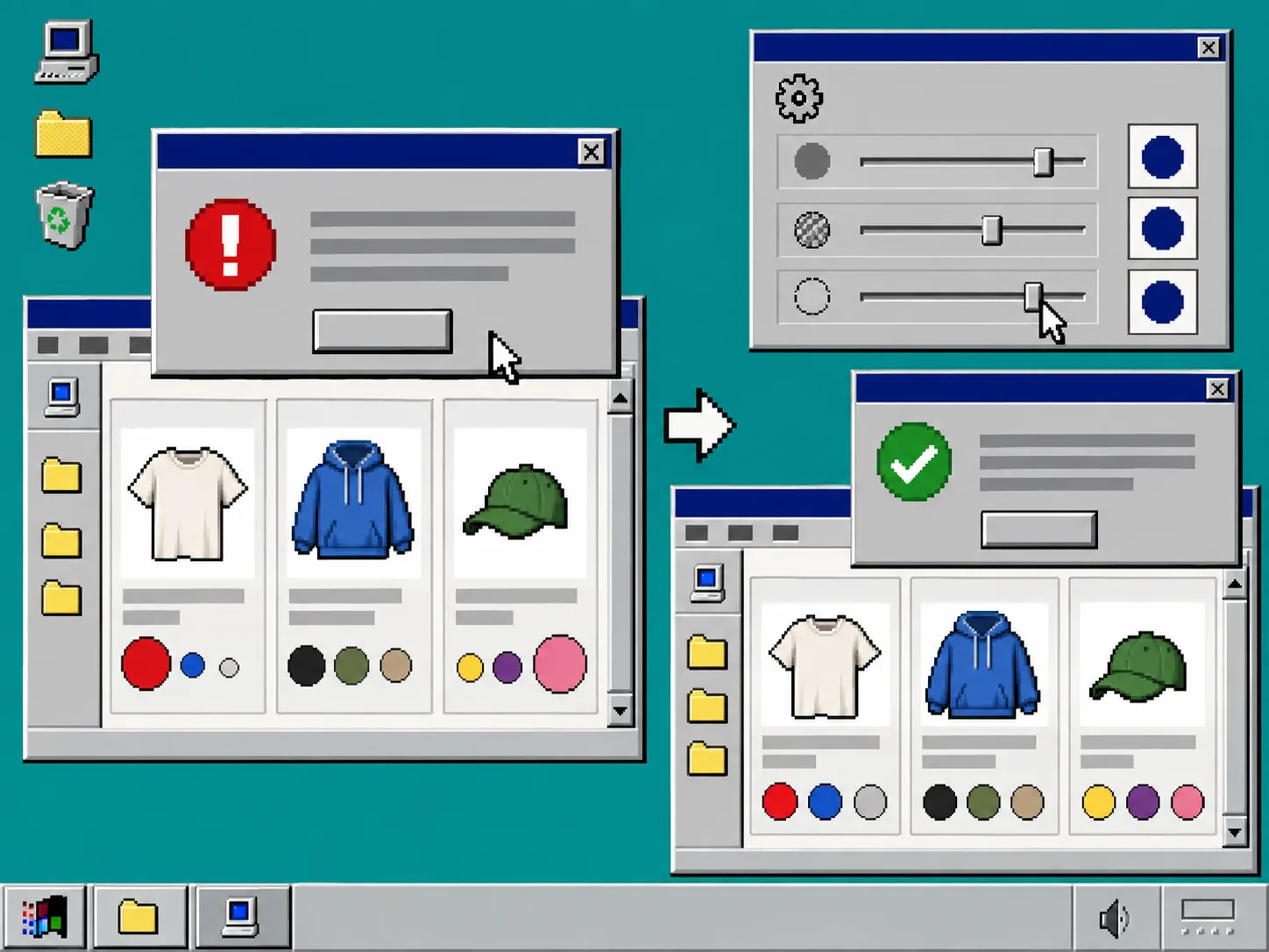
Do not configure thousands of products before you see the customer path working. Start with one color family, check product and collection pages, then repeat the same naming and styling rules for the next group. Supra Swatch Colors is built to manage large swatch and product-group catalogs, so a consistent first template is worth more than a rushed bulk setup.
The next action is straightforward: install Supra Swatch Colors, configure one representative family, and complete the five-step shopper test before rolling it out across the store.