How to Standardize Shopify Color Names Before You Add Swatches
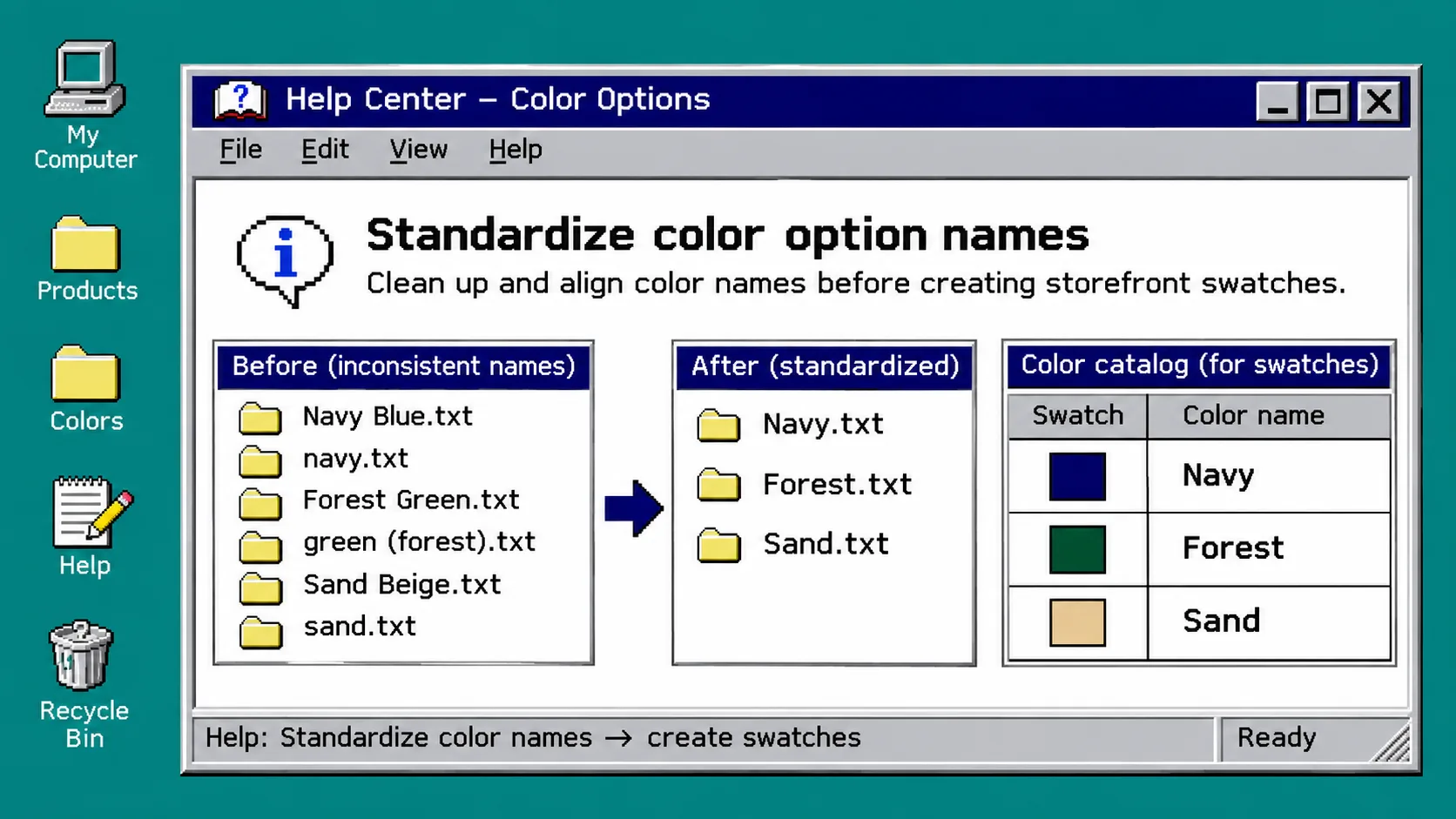
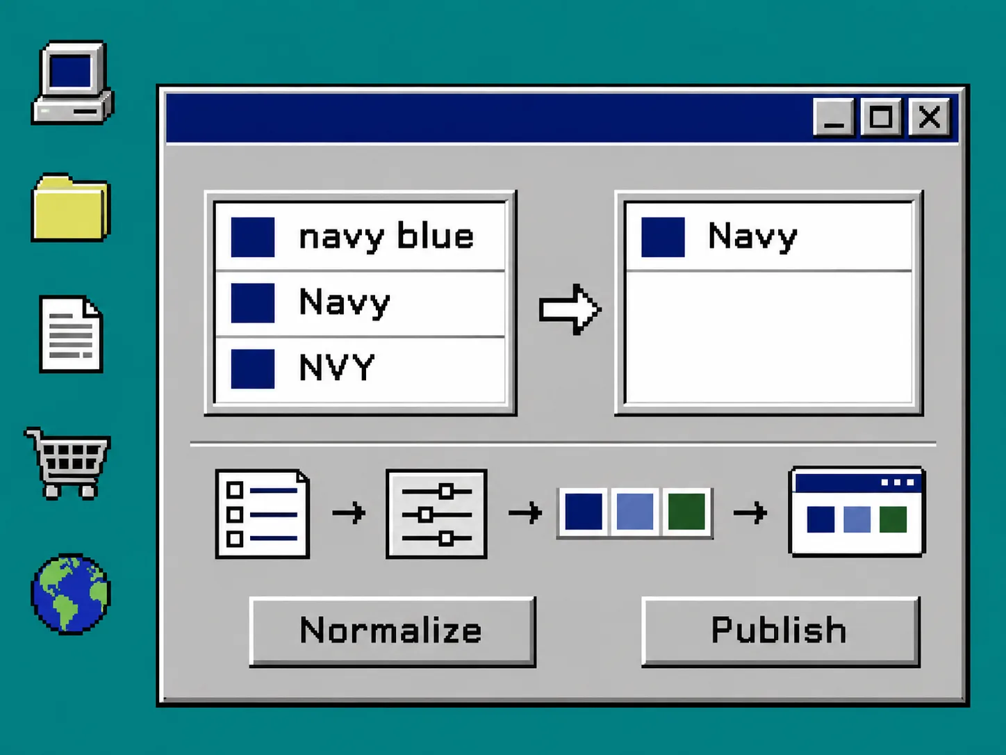
If your Shopify products call the same shade Navy, navy blue, and NVY, fix the catalog names before styling a single swatch. Use one shopper-facing label per sellable shade, decide whether that shade is a variant or a separate product, then test the selection on both product and collection pages. This keeps a color click connected to a real purchasable choice instead of a decorative dot.
You need access to Products in Shopify and a saved copy of the product list you are changing. Shopify treats each combination of option values as a variant, so option names are part of the actual catalog structure—not merely storefront copy. Shopify’s variant documentation is the useful baseline here.
1. Export or list the color values you already use
Open Shopify admin → Products, then review the products in one color family. Record the option name and each value exactly as it appears: Blue, Navy, navy, Midnight Blue, and so on. Include products that appear together in a collection.
Do not begin by changing chip colors. First find duplicates that mean the same buyer choice and names that hide a meaningful difference. Navy and navy blue might be one shade; Navy and Midnight might not. Check the product media, supplier code, and merchandising brief before merging anything.
Use this small control table as your source of truth:
| Catalog value found | Publish as | Treat as the same shade? | Notes |
|---|---|---|---|
| navy / Navy blue | Navy | Yes, after media check | One label on all relevant products |
| forest | Forest green | Only if the product photography agrees | Avoid vague internal shorthand |
| sand | Sand | No change | Keep buyer language simple |
Shopify can connect category metafield entries to variant options, which is helpful when you need reusable, consistent option data across products. Its color-swatch guide also notes that storefront display depends on a theme that supports variant swatches.
2. Choose variants or linked products before you configure chips
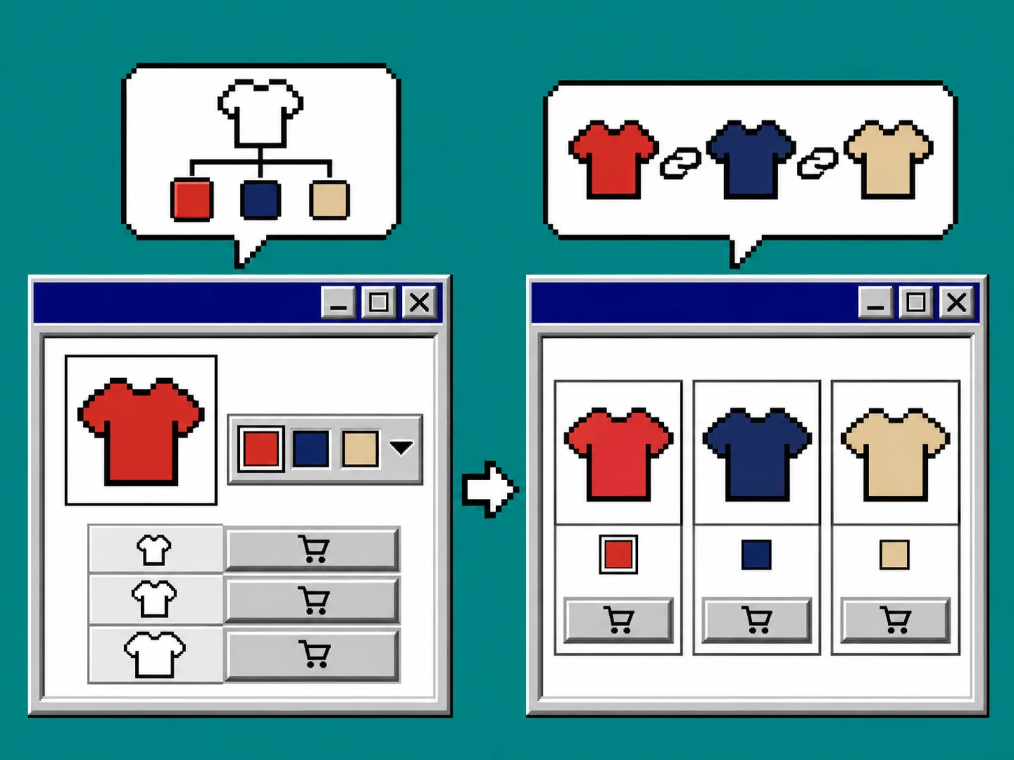
Use variants when the shopper remains on one product page and the choice changes a color, size, price, inventory, or media combination. Use linked products when each colorway deserves its own product page, description, media story, or merchandising URL. Do not use separate products solely to paper over inconsistent names.
A quick decision rule:
- Keep it a variant when the products share one buying decision and one product description.
- Link products when the colorway is independently merchandised or must have its own product details.
- Stop and review when a color name would map to multiple different photos or stock records.
Supra Swatch Colors supports both variant color options and swatches that link separate product pages, so you can apply the same cleaned-up label system to either structure. Its Shopify App Store listing is the place to start configuration after the catalog decision.
3. Rename values in a controlled pass
Work one family at a time. In Products → select a product → Variants, update the option value to the approved shopper-facing name, save, and move to the next matching product. Shopify’s instructions for adding and editing variant options are worth keeping open because the product-details experience is changing for some stores.
After each small batch, verify these three things:
- The intended variant still points to the right price, SKU, inventory, and media.
- No duplicate combination has been created.
- A shopper can still select every valid size-and-color pairing.
Do not promise that a swatch will solve an unavailable combination by itself. A color choice that leaves every size sold out needs a clear unavailable state and a real customer path. If you are retiring old shades, use the same inventory-aware approach described in How to Retire Shopify Color Swatches Without Confusing Shoppers.
4. Configure swatches only after the data agrees
Now configure the display layer. In Supra Swatch Colors, use the approved value as the match point, then select the color or image treatment that helps a shopper identify the choice. The app supports color and image swatches on product and collection pages, plus linked-product and variant workflows.
Keep the visual cue faithful: a solid chip is useful for a flat color; an image swatch is safer when texture, print, or material changes the buyer’s expectation. Before rolling this out, compare your plan with the linked-product swatch migration checklist and a clear color-choice path. Both reinforce the same point: the click must make the next page state obvious.
5. Test product pages and collection cards
Preview the theme before publishing. Shopify says swatch support depends on the theme, and its theme requirements call for product options to support visual hex or image swatches where applicable. Test in a private browser window as well as in the theme editor.
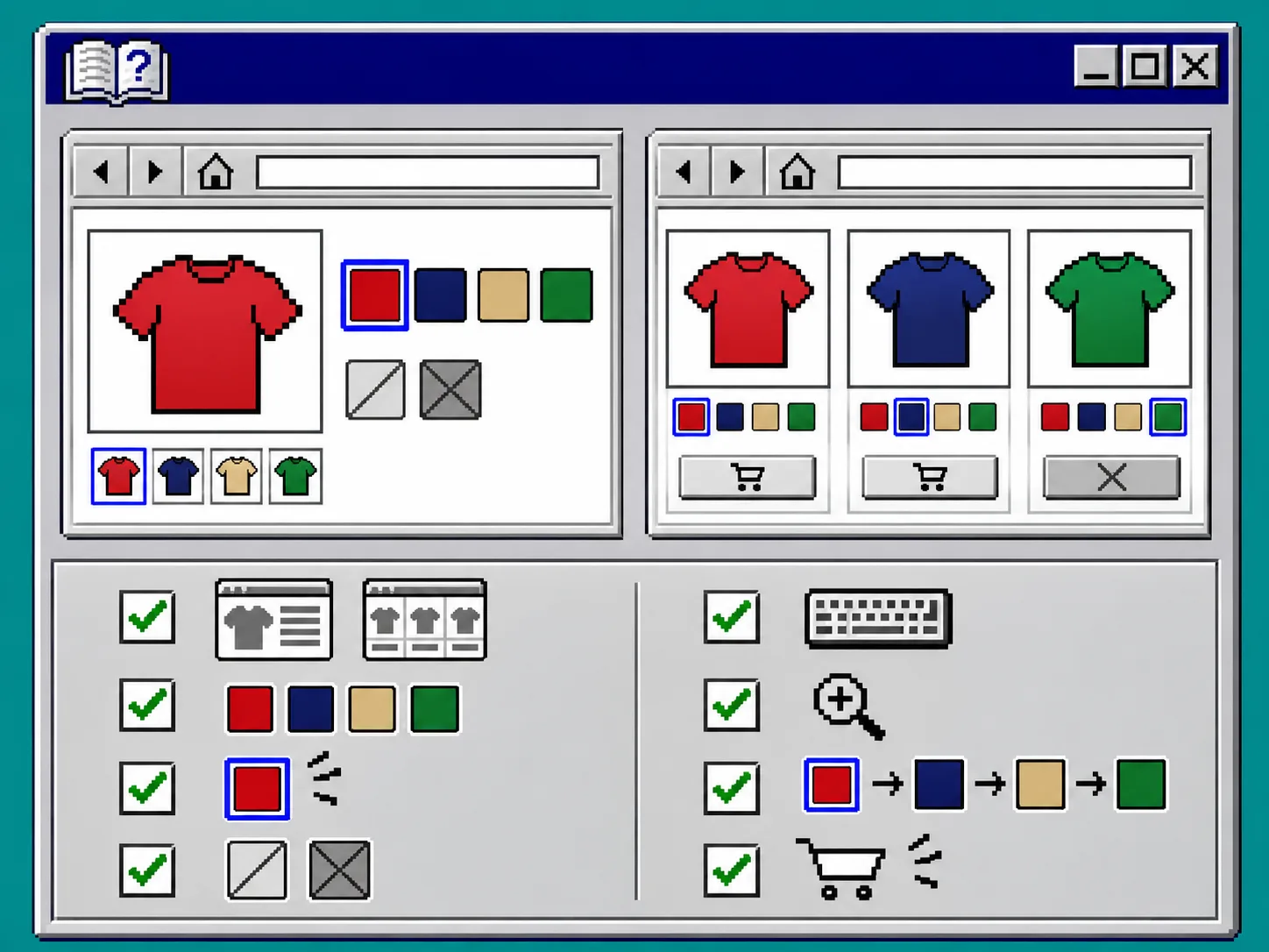
Run this five-minute checklist:
- Click every color on a representative product and confirm the label, image, price, availability, and URL or variant state are correct.
- Change size after color and confirm unavailable combinations are visibly disabled or explained.
- Use a keyboard to reach and select each swatch; a color alone should not be the only identifier.
- Open a collection page and confirm its swatches lead to the same color meaning as the product page.
- Check mobile width so chips do not wrap into an ambiguous, unlabeled row.
If you see different names for the same shade, return to the source-of-truth table rather than adding another visual exception. For a broader merchandising check, see How to Keep Shopify Swatches Consistent on Product and Collection Pages.
Troubleshooting
The swatch is visible but chooses the wrong variant. Recheck the option values, variant combinations, and any product-group mapping. Correct the catalog value first, then refresh the app’s configuration.
The product page works but the collection card does not. Confirm the theme and collection integration are enabled, then test a product that has the same finalized color values as the one you used for setup.
Two chips look identical but mean different products. Use an image swatch or a more specific label when the material or print matters. Do not collapse distinct sellable products into one generic color.
Keep the catalog readable before making it colorful
A reliable swatch starts with a reliable product option. Standardize the name, choose the right product structure, and test the shopper’s whole path before styling the chip. When the data is ready, install Supra Swatch Colors from the Shopify App Store and configure the display without rewriting your catalog again.