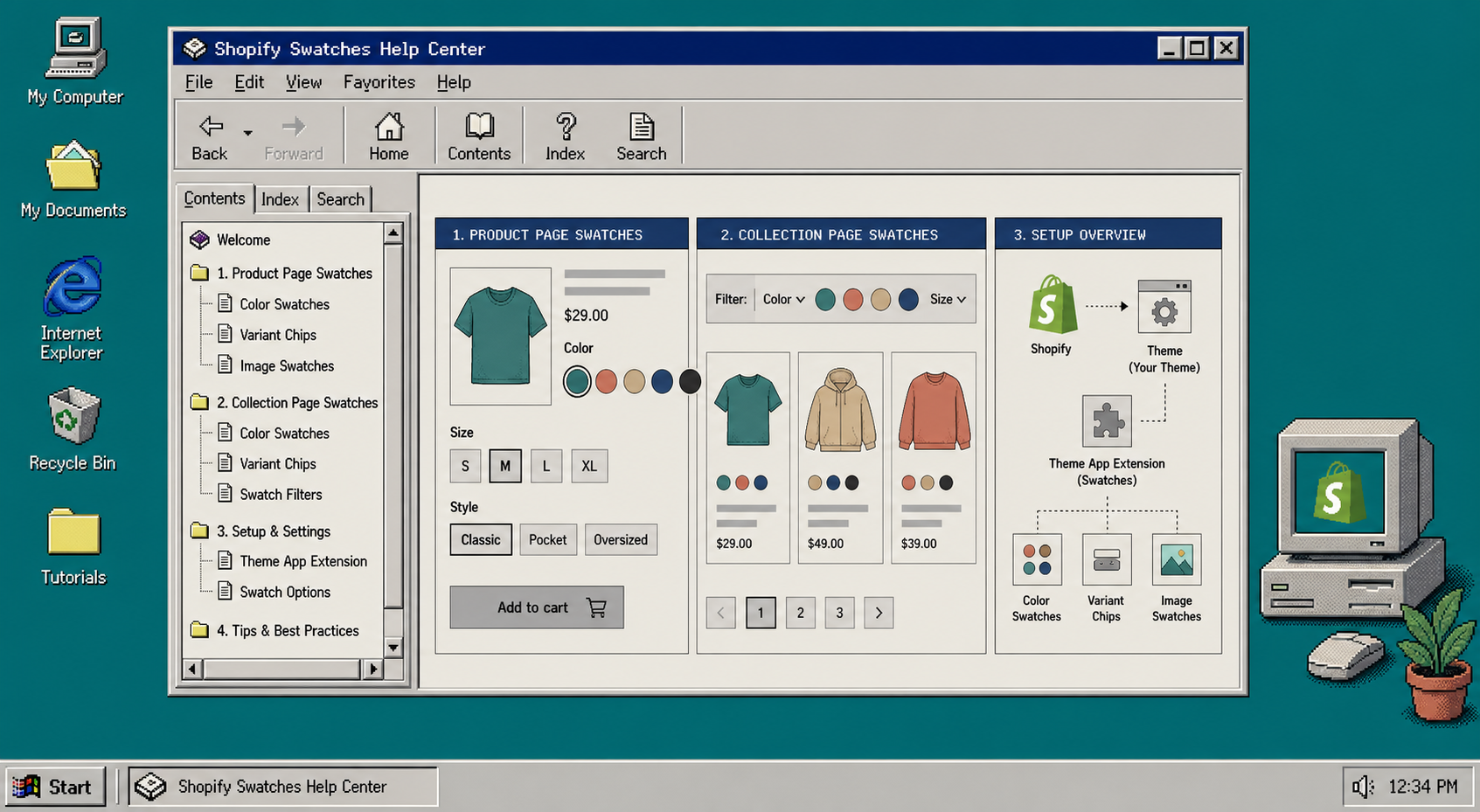
If your product pages still use plain dropdowns, the fastest fix is to turn the important options into swatches and make sure they also show on collection pages. I’ve seen stores lose clicks because the catalog looks fine on the product page but feels slow in the grid. The clean setup is simple: decide which options should be swatches, turn them on in Supra Swatch Colors, and test the result on both product and collection templates.
Supra Swatch Colors is a no-code Shopify app for color and image swatches. It supports product and collection pages, linked products, variant swatches, multilingual shops, and 20+ styles. If you want to follow along, install it from the Shopify App Store.
What you need first:
- A Shopify theme you can preview safely.
- Products that already use color, image, or other variant options.
- A clear decision on when to use one product with variants and when to link separate products.
- At least one clean collection page to test.
If you are still deciding between linked products and variant swatches, start with How I Choose Between Variant Swatches and Linked Products in Shopify. That choice matters before you touch the styling.
1. Map Each Option To The Right Swatch Type
Start by sorting your options into two buckets:
- Use variant swatches when the choice stays on the same product and the shopper should compare color or style without leaving the page.
- Use linked products when each option deserves its own page, its own URL, or its own inventory setup.
That split keeps the catalog understandable. A common mistake is to force every color into a separate product page, which makes the collection grid noisier and hurts the browsing flow. Another mistake is the opposite: stuffing everything into one product when the shopper really needs separate pages to compare details.
If your color chips depend on clean visuals, I also keep the upstream image workflow tidy. These two posts help with that part of the job: How I Prioritize Shopify Product Photos for AI Editing and How to Choose the Right AI Edit for Each Shopify Product Photo.
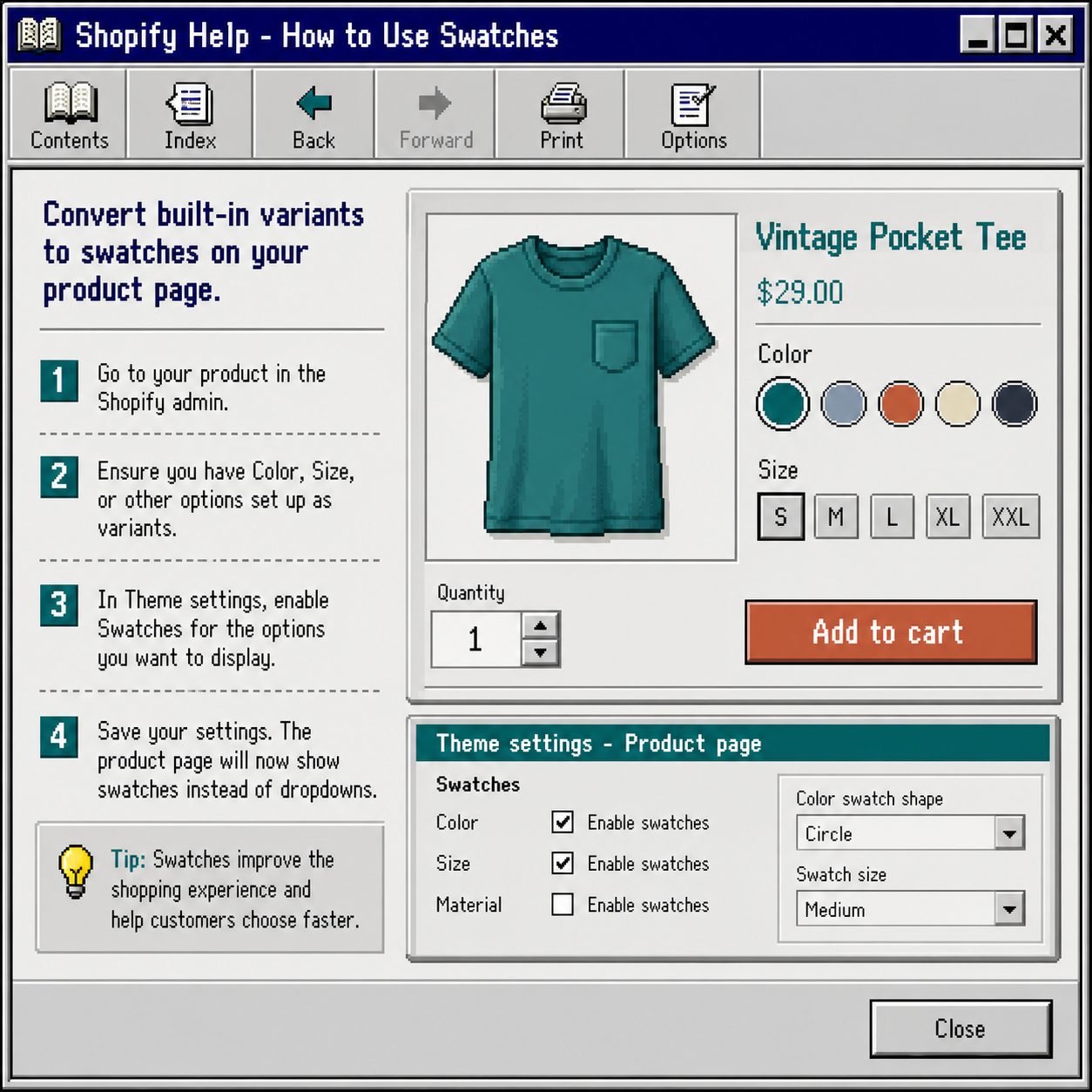
2. Turn On Swatches For The Right Product Options
Open the app and set up the options you want to display as swatches. The app supports color and image swatches, and it can auto-detect colors in your store or use product images to build the swatch quickly.
When I set this up, I pay attention to three things:
- The option name should be consistent across products.
- The swatch style should match the rest of the storefront.
- The label should be easy to read on mobile.
The app’s 20+ styles matter here because a swatch can be functional and still feel branded. Keep the size and tooltip readable, but do not make the swatch so large that it overwhelms the product card.
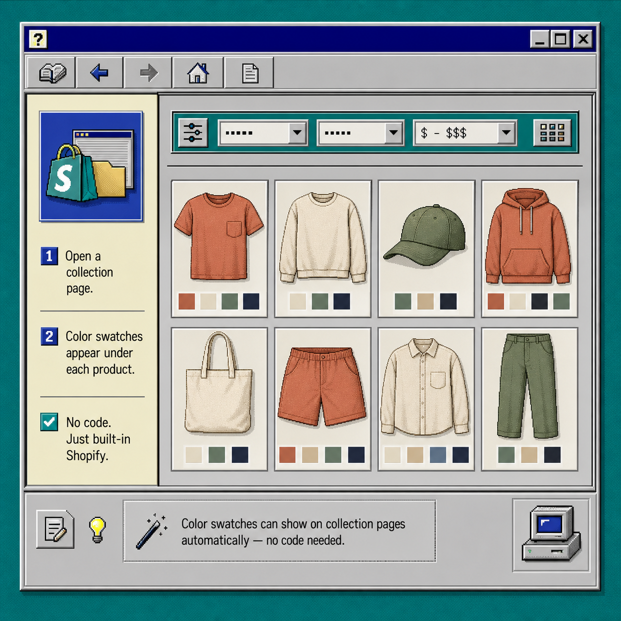
3. Enable Swatches On Collection Pages
This is the part that usually changes the browsing experience. On collection pages, swatches let shoppers compare color or style before they open a product.
Turn on collection-page support, then open a collection grid and check that the swatches appear where a shopper expects them. On a good setup, the collection card still looks clean, but the shopper can scan product choices without drilling into every item.
I like this step because it fixes the “looks fine on the product page, but too much clicking in the grid” problem. If your store depends on image swatches rather than flat color chips, the broader product-photo workflow in How to Decide Which Shopify Products Need Try-On, Placement, or Video can help you decide when the visual should be a swatch and when it should be a richer product image. For catalogs that need even cleaner input images, How to Build a Shopify 3D Capture Shot List is a useful upstream reference.
4. Match The Style To The Theme
Supra Swatch Colors works on all themes, but the best results still come from matching the swatch size, tooltip, and label style to the rest of the store.
I usually check these settings in this order:
- Pick a swatch shape that matches the brand feel.
- Set a size that is easy to tap on mobile.
- Make sure the label does not crowd the product title or price.
- Confirm the swatches still look balanced in collection cards.
- Test the same product on desktop and phone.
If your store is multilingual, keep the option names and labels consistent across languages. The app supports multilingual shops, so the main thing to watch is consistency in your own catalog data.
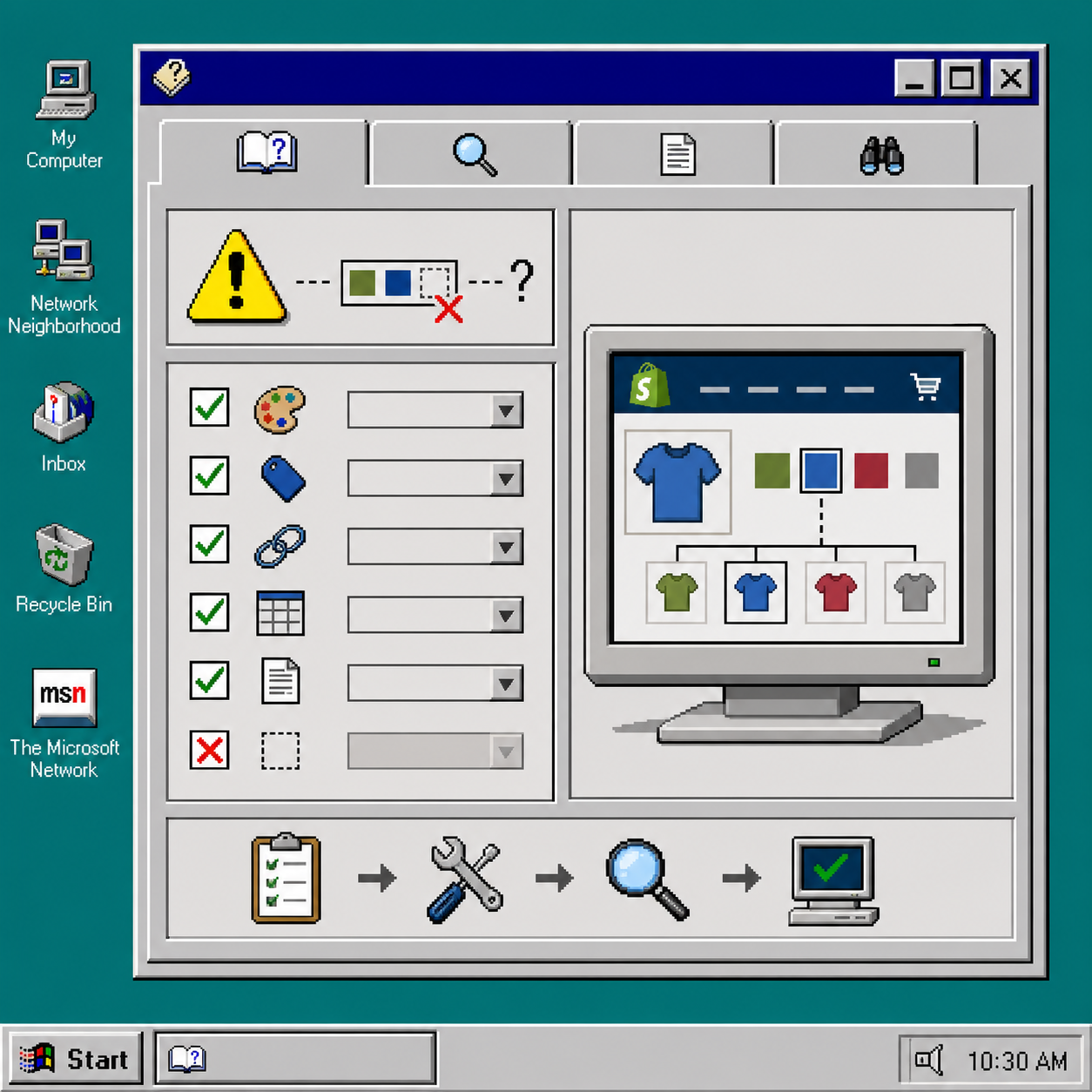
5. Troubleshoot The Common Swatch Problems
When swatches do not show up the way you expect, it is usually one of a few things:
- The option is not set up as a real variant.
- The collection page template is not using the app’s swatch support.
- The color name is inconsistent across products.
- The image swatch source is too messy to read clearly.
- The style is correct, but the spacing breaks on mobile.
For the image-swatch case, I treat the visual input as part of the setup. If the product photos are muddy, the swatches will feel muddy too. That is why I like to clean up the source images first with a workflow like How I Prioritize Shopify Product Photos for AI Editing.
Recap
The safest way to set up Shopify swatches is to decide the product model first, enable the right swatches in the app, and then test both product and collection pages before you roll it out catalog-wide. That keeps the storefront clean and makes the collection grid easier to shop.
If you want the no-code route, install Supra Swatch Colors, set up one collection, and verify that the swatches look right on mobile before you move on to the rest of the catalog.