How to Build a Cleaner Shopify Swatch System Without Theme Code
When swatches get messy, the problem is usually not the colors themselves. It is that one store is asking the same control to do three different jobs: variant selection, product navigation, and collection browsing.
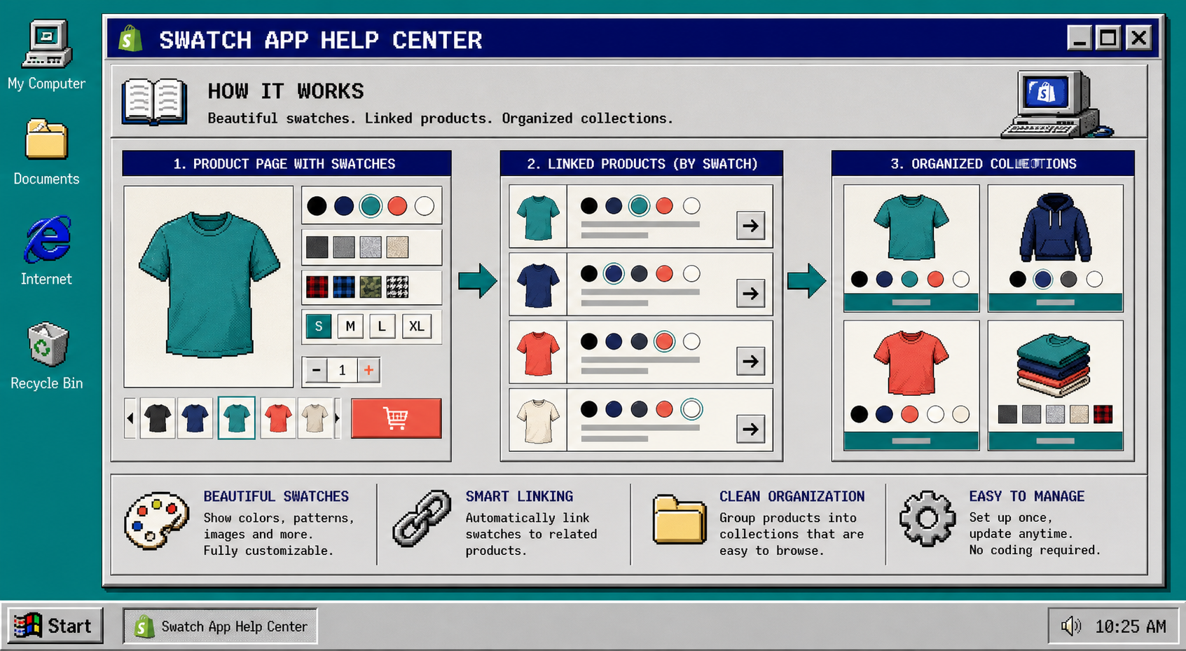
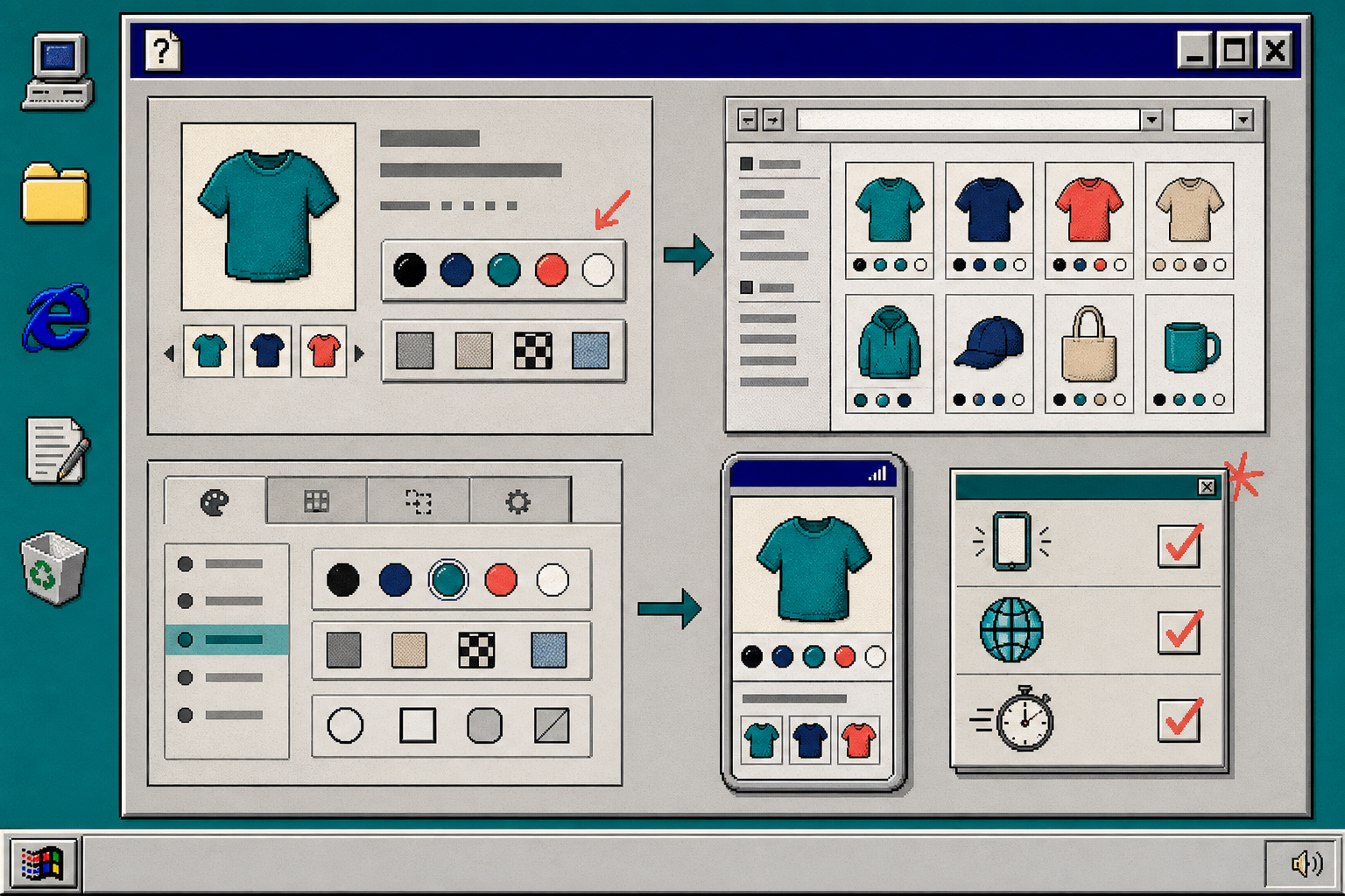
The clean fix is to decide what each swatch means, then keep that meaning consistent across product pages and collections. If you want a no-code way to do that, Supra Swatch Colors gives Shopify stores product-page swatches, linked-product swatches, collection-page swatches, and a wide set of visual styles without theme edits.
What You Will Set Up
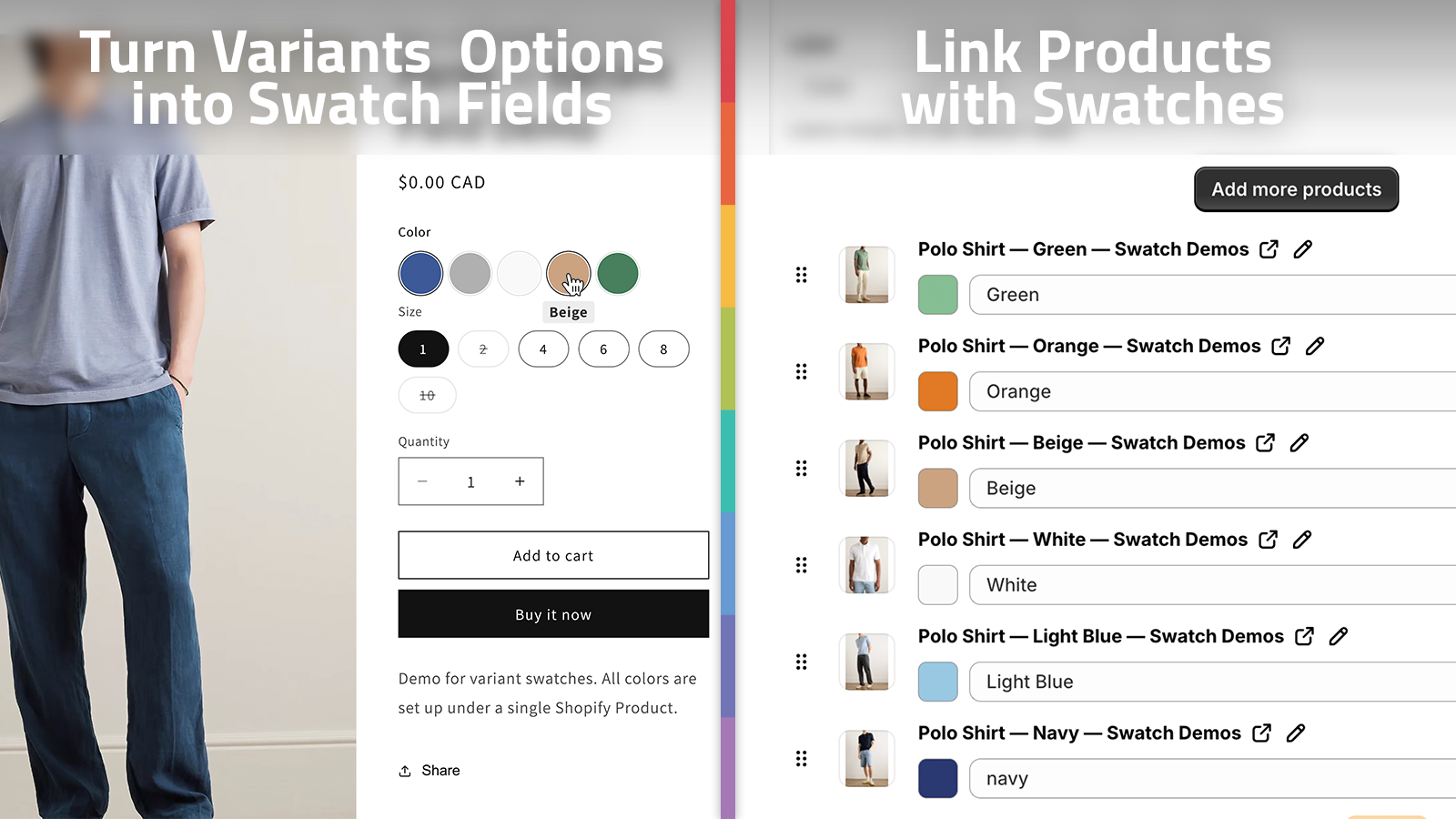
- Variant swatches for colors, sizes, or material choices
- Linked-product swatches for product families
- Collection-page swatches so category browsing stays visual
- A style pass that keeps swatches readable on mobile
- A quick test checklist before you publish
If you are still deciding whether a swatch should point to a variant or a separate product, the operator notes in How I Choose Between Variant Swatches and Linked Products in Shopify and How to Choose Between Variant Swatches and Linked Products in Shopify are worth reading first. If you already know the model but want broader setup context, How to Set Up Shopify Swatches Across Product and Collection Pages is the companion piece.
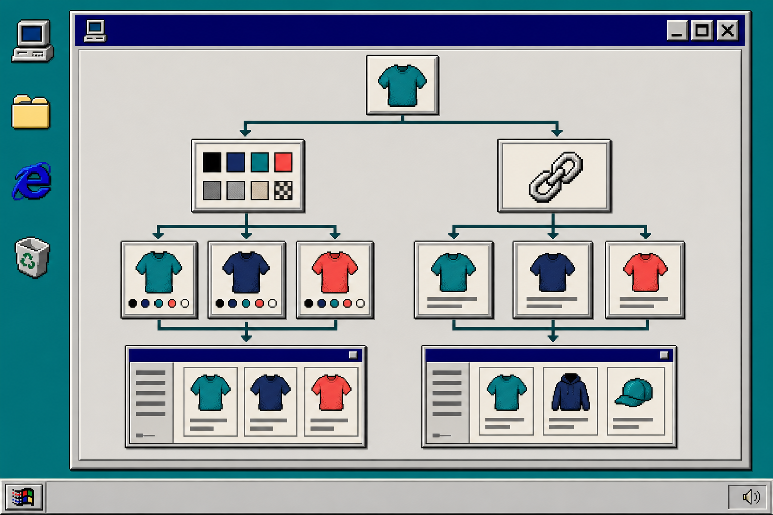
1. Decide What Each Swatch Means
A swatch needs one job. If it means color, keep it as a variant. If it means this is a related product, use a linked-product swatch. Do not blur them unless the shopping experience genuinely needs both.
For example:
- Use variants for T-shirts, mugs, or pillows where the product is the same and only the choice changes.
- Use linked products when each option has different photos, pricing, or inventory.
- Use collection-page swatches when shoppers need to move faster through a category without opening every product.
I have seen stores make swatches confusing by letting one label stand for both a color and a product family. That works right up until the customer expects one thing and gets another. A simple rule set keeps the whole storefront easier to scan.
2. Build the Product Group Once
Supra Swatch Colors is built for both sides of that problem. It can transform built-in variants into swatches, or it can link separate product pages with swatch colors. It also works on collection pages, so you can keep the same visual language from the product page into the browse view.
The fastest setup is usually:
- Pick one product family that already sells well.
- Decide whether each option is a variant or a separate product.
- Add the swatch mapping once.
- Reuse the same pattern on the rest of the family.
That is where the app saves time. It can auto-detect colors used in the store, or you can use product images to set up swatches faster. If you are managing a bigger catalog, that matters more than it sounds like it should.
3. Keep the Swatches Readable, Not Decorative
One mistake I see a lot is treating swatches like decoration. They are not decoration. They are navigation.
The visual controls need to be obvious enough that a shopper can tell what changed without hunting around the page. Supra Swatch Colors gives you 20+ styles, plus control over tooltip, label, swatch size, and shape. That makes it easier to match the swatches to the brand without turning the interface into a puzzle.
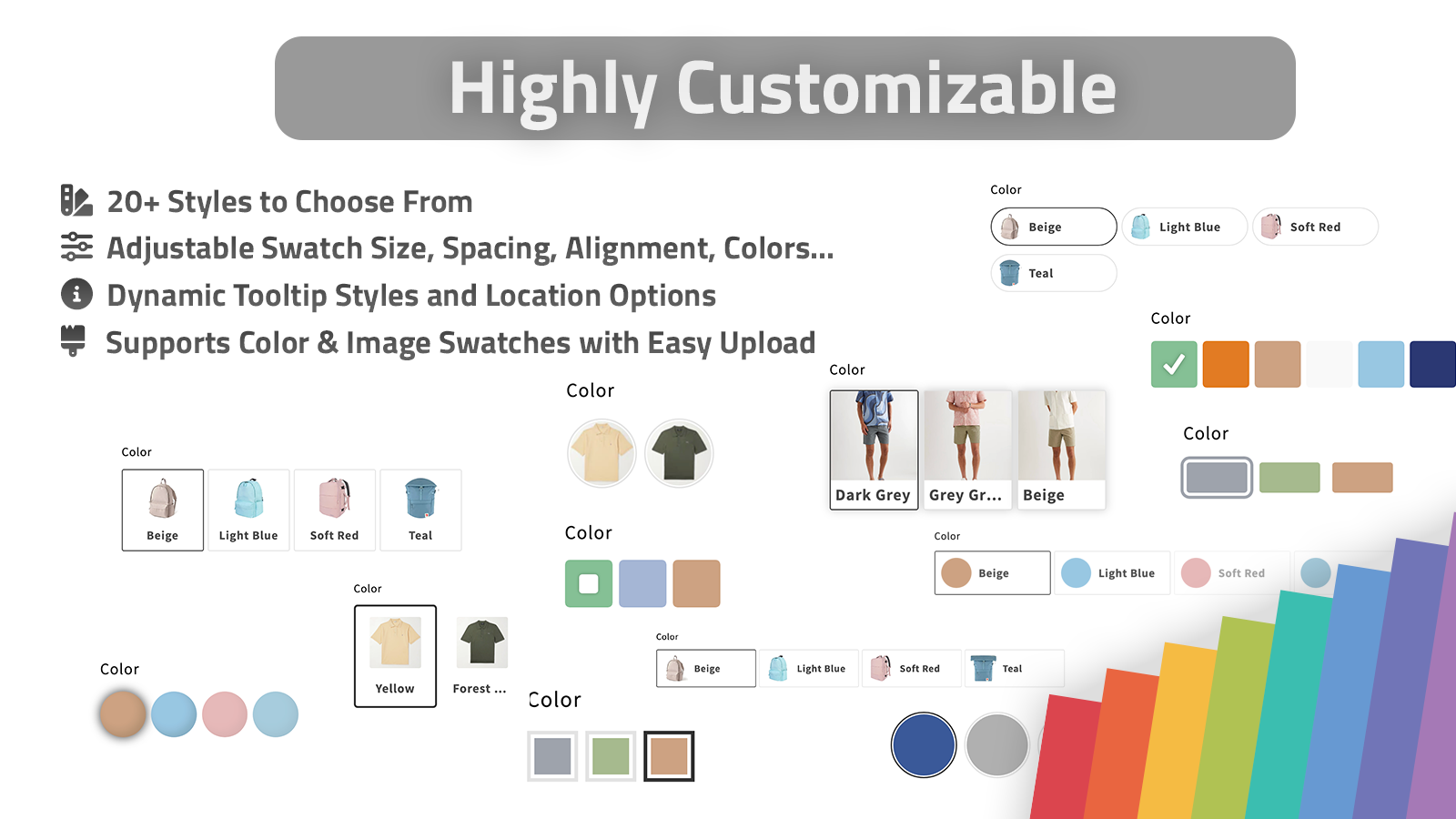
My rule is simple:
- Keep color swatches compact and readable.
- Use image swatches only when the image helps the choice.
- Keep labels short enough to fit on mobile.
- Leave enough space around each swatch so taps do not feel cramped.
If your store is multilingual, test the labels in every language you ship. The app supports multilingual shops, but your own naming still needs to stay clear after translation.
4. Turn On Collection-Page Swatches
Collection pages are where swatches can either help a store feel organized or make it feel cluttered. If the swatches are useful, shoppers can compare product families faster and click into the right page sooner. If the swatches are noisy, they become one more thing to ignore.
The safe approach is to start with the collection pages that already have strong product grouping. Then add swatches only where a visual cue genuinely helps the shopper decide.

This is also where linked-product swatches become useful. A collection page can show that a shirt, hoodie, and cap belong to the same color family without forcing the shopper to open every product detail page.
If you want the broader product-page setup, the article How I Build a Shopify Product Page Around a 3D Model is a good pairing because both problems are about helping shoppers understand a product faster.
5. Test the Setup on Mobile Before You Publish
Before you roll the swatches out across the whole catalog, test one product family on desktop and mobile. You are looking for the small stuff:
- Does the selected swatch stand out clearly?
- Do the labels still read well on a narrow screen?
- Do the product and collection pages feel consistent?
- Do the swatches load instantly enough that the page still feels smooth?
- If you use linked products, does the transition feel like browsing and not like a broken jump?
If you want to watch the setup flow instead of just reading it, the Getting Started tutorial and the How to Link Shopify Products with Color Swatches video are the two most useful walkthroughs from the product docs.
Troubleshooting
If the swatch looks fine on the product page but not on the collection page, check that collection-page swatches are enabled for that product family.
If the swatches feel cluttered, reduce the visual variety first. In practice, that usually means smaller labels, fewer styles, and a more restrained color palette.
If a multilingual store shows awkward labels, shorten the source labels before you ship. Translation cannot fix a label that is too long to begin with.
If you are unsure whether to model an option as a variant or a linked product, step back and compare the shopping intent. If it is the same product with one attribute changed, use a variant. If it is a meaningful product switch, use a linked swatch.
The Cleanest Next Step
If your current swatches are doing too much, start with one product family and define the rule once. Keep variants as variants, keep linked products as linked products, and let collection-page swatches do the browsing work.
From there, you can expand the pattern across the catalog without touching theme code. If you want to try it, install Supra Swatch Colors on the Shopify App Store and build the first swatch set around your best-selling product family.