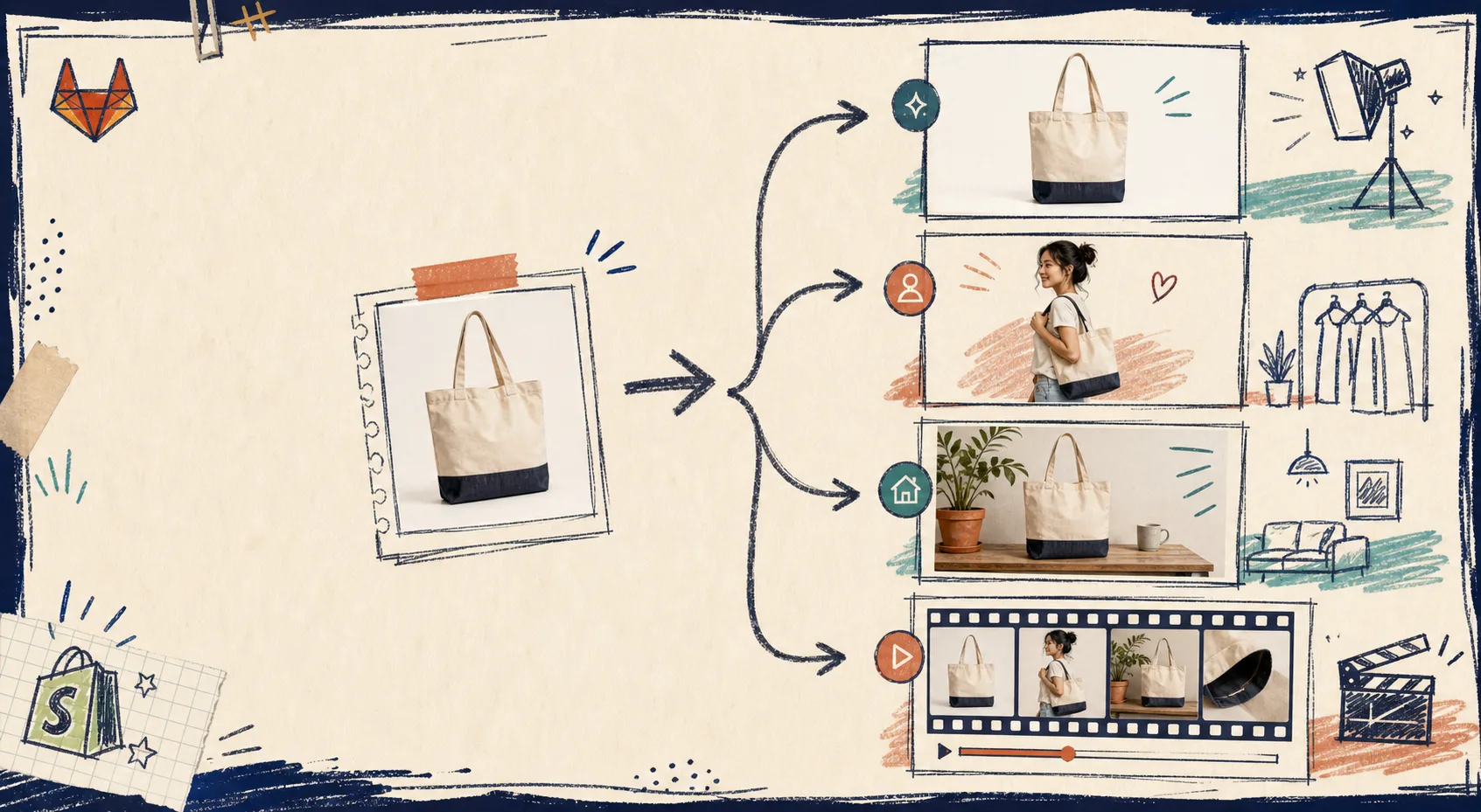
How to Build a Shopify Photo Workflow for Try-Ons, Mockups, and Video
If I only have one decent product photo, I stop thinking in terms of “one image, one job.” The better move is to turn that single source file into a small asset kit: a cleaner catalog shot, a try-on, a lifestyle placement, and a short clip. That is the lane Supra AI Photo Studio is built for.
The app lives here: Supra AI Photo Studio and on the Shopify App Store. It gives you background removal, upscaling, auto-enhance, AI try-on, object placement, and product video generation inside a single Shopify workflow.
What You’re Actually Building
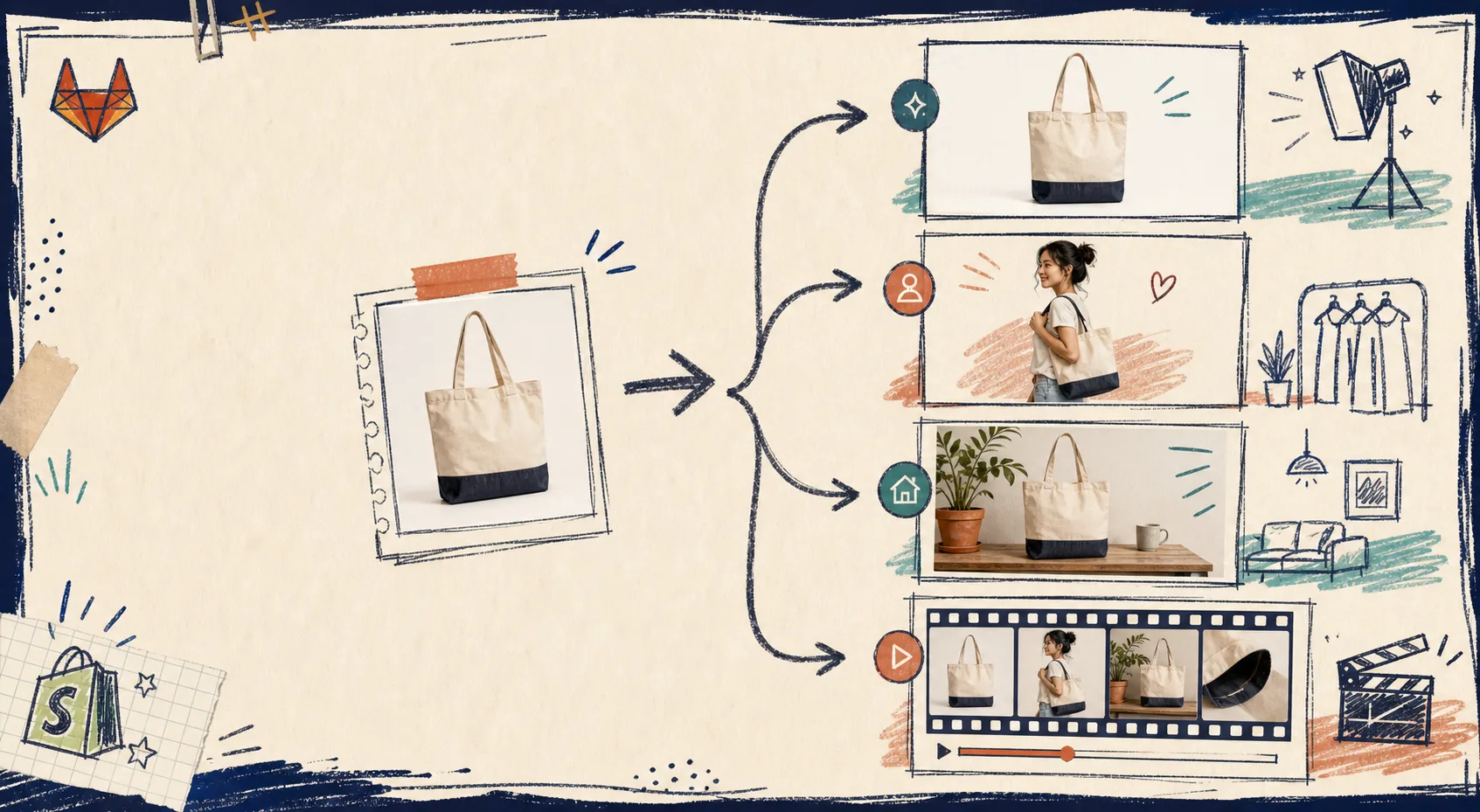
The point is not to generate more images for the sake of it. It is to make the same product easier to trust in more places. If a shopper needs to see fit, context, or motion before they buy, you create that asset instead of forcing one photo to do every job.
A quick rule I use:
- Clean the source first.
- Use try-on when the product is worn.
- Use object placement when the product needs a scene.
- Use video when the product needs energy.
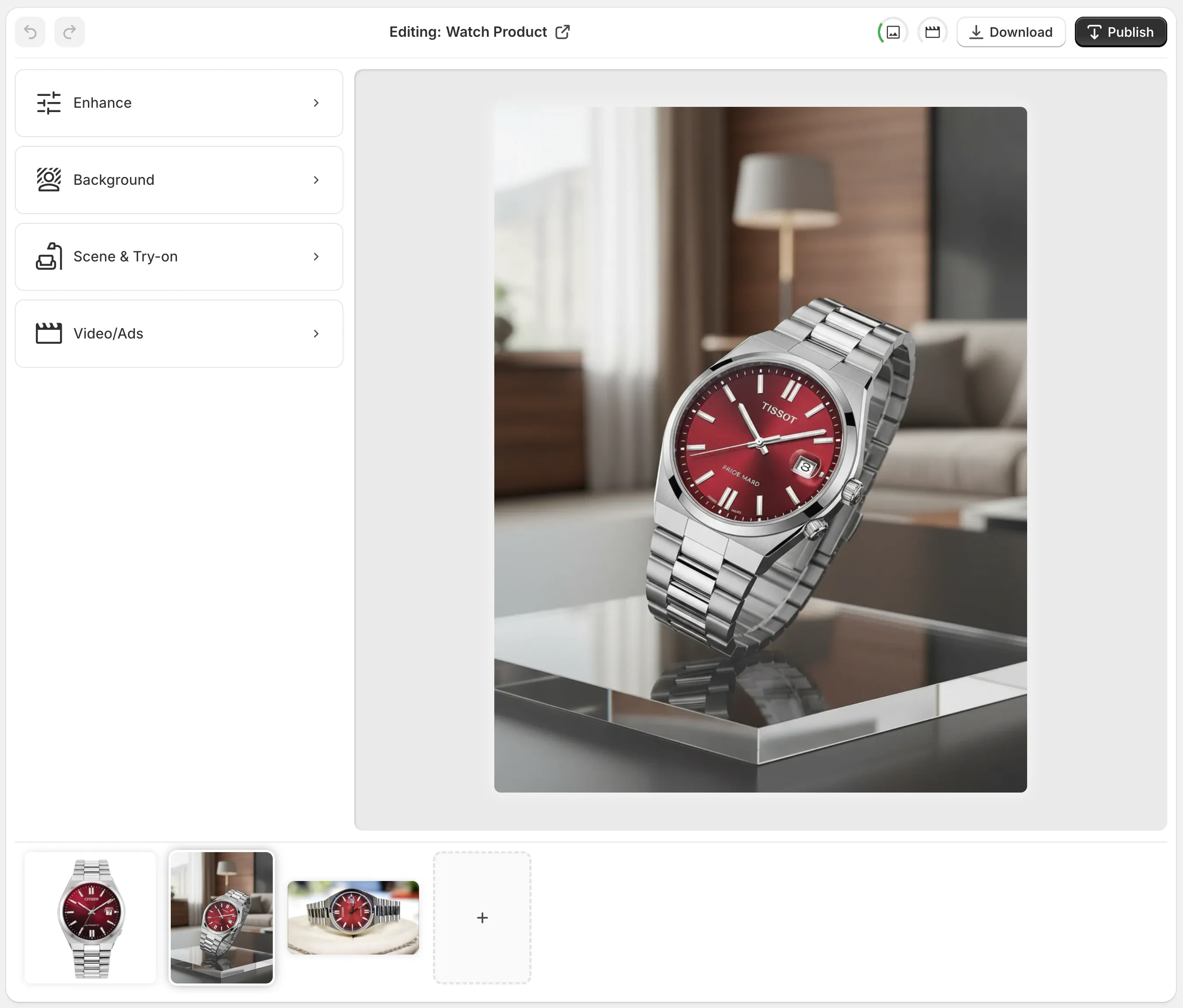
That order lines up with the app editor too. The help screenshot shows the layout clearly: pick a product or upload an image, then move through the tools, canvas, and gallery in a predictable pass.
The workflow map below is how I think about the move from one source shot to multiple outputs.
If you want the decision logic before you start, I’d pair this with A Practical Shopify Product Photo Decision Tree for AI Editing and How I Review a Shopify Product Photo Before I Generate Variants.
Clean the Base Photo First
For almost every product, I start by making the source less annoying. Background removal, upscaling, and auto-enhance are the boring steps that make the fancy steps work.
If the original photo is soft, dim, or cluttered, the AI outputs tend to inherit that weakness. Cleaning the base photo first gives you a better cutout, better edges, and fewer weird artifacts later.
This is where the app is useful for quick catalog recovery. You can isolate the product, fix the lighting, and keep moving without rebuilding the entire asset.
Pick the Next Output by the Job It Has To Do
Use AI try-on when fit matters
If the item is clothing, jewelry, or an accessory that depends on body context, try-on is the clearest next step. The goal is not to make the product look “cool.” The goal is to make it feel believable.
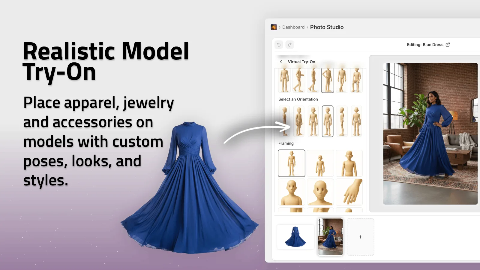
I use this when the shopper needs to understand scale, drape, or styling. It is a much better fit than forcing the same item into a generic studio shot.
Use object placement when the product needs context
If the product is a home item, accessory, or visual add-on, object placement usually gets you farther than a plain catalog retouch. Put it in a kitchen, office, boutique, or outdoor setting that matches the story you want the customer to picture.
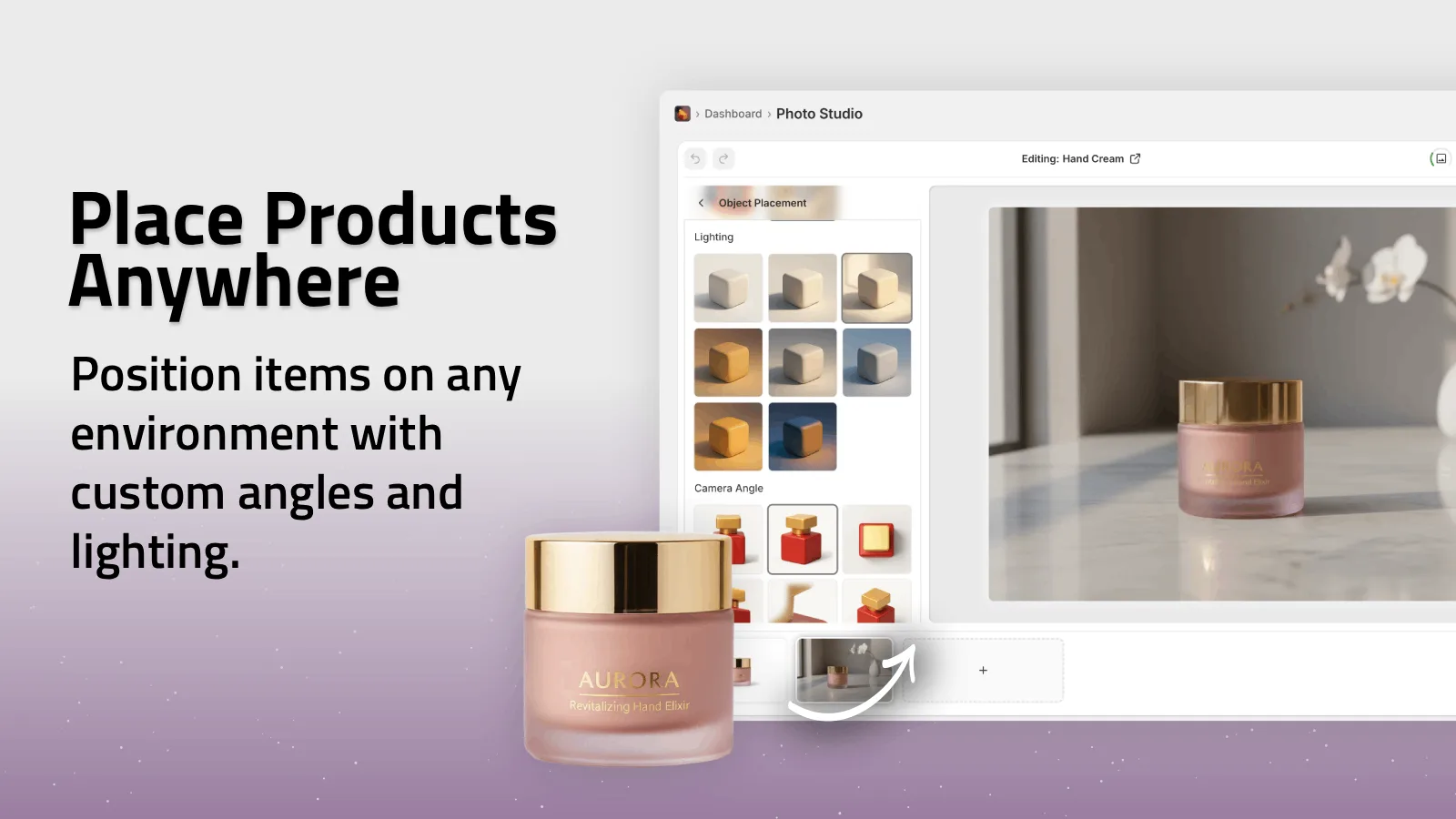
This is the stage where a lot of stores stop looking like they were assembled from random supplier photos. The product finally has a world around it.
Use video when the asset needs motion
If the item benefits from a quick punch of energy, the b-roll and UGC-style video tools are the fastest way to get there. I would not make every product a video, but I do like having one or two motion assets per launch when I know paid social is part of the plan.
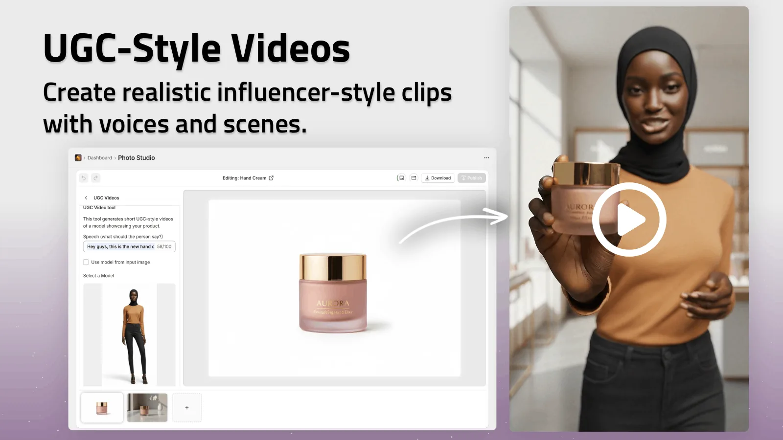
That gives you something for ads, reels, and product pages without starting from scratch.
Keep the Set Coherent
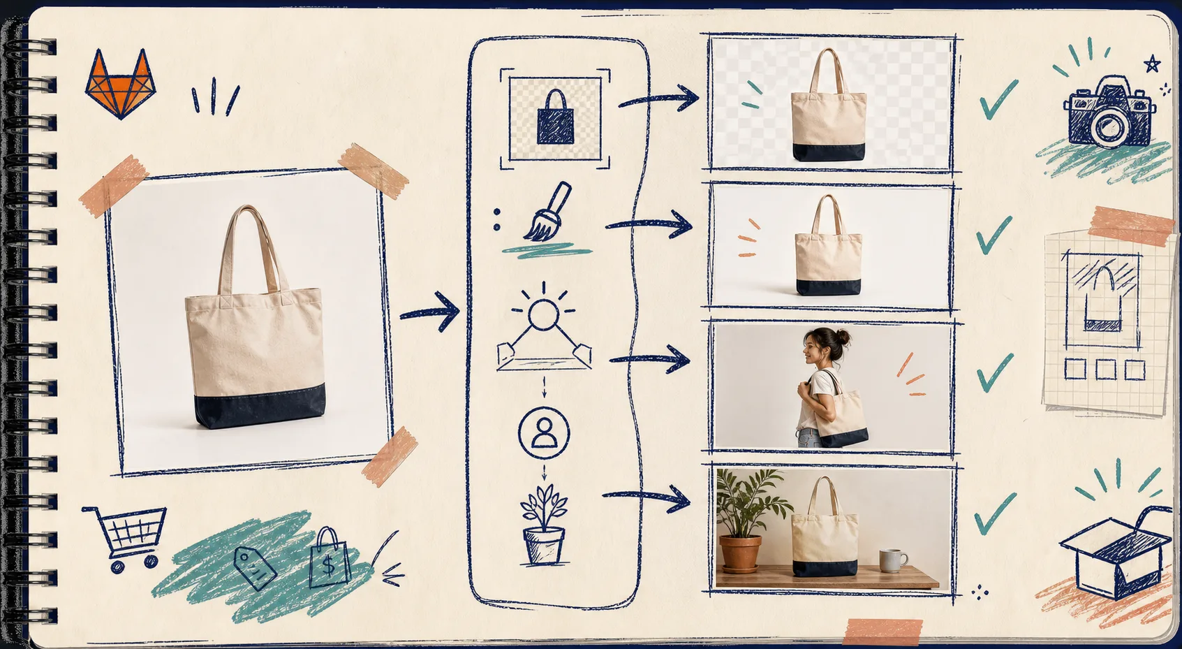
Once you have more than one output, consistency matters more than novelty. Same crop. Same product angle when possible. Same visual story. If one asset looks like a bright studio photo and the next looks like a moody lifestyle shot, the product page starts to feel stitched together.
The second generated image is a good reminder of the sequence I try to keep: clean, then place, then adapt.

If the source photo is already old or inconsistent, I’d read How to Turn One Product Photo Into Store Photos, Try-Ons, and Ad Clips before I generate variants. And if you want the more catalog-specific version of this thinking, How to Turn One Product Photo Into a Full Shopify Image Set is the companion post.
The Short Version I Actually Use
If I had to compress the whole workflow into one pass:
- Clean the source image.
- Decide whether the product needs fit, context, or motion.
- Generate the smallest useful set of assets.
- Check that every output still looks like the same product.
- Stop before the catalog starts to feel overworked.
That is the difference between “AI made me a pile of images” and “I now have a usable visual system.”
The app helps with the messy middle part, which is usually where stores lose time. If you want to see the feature set in action, the landing page and Shopify listing are the fastest places to start. There is also a demo trailer if you want a quick look before you try it.
Next Step
Start with one product that already has decent source photography, run it through background removal and enhancement, then try one of two branches: model try-on for wearable items or object placement for everything else. If you need a motion asset, add one short video at the end.
That is the smallest workflow that still feels like a real catalog system.