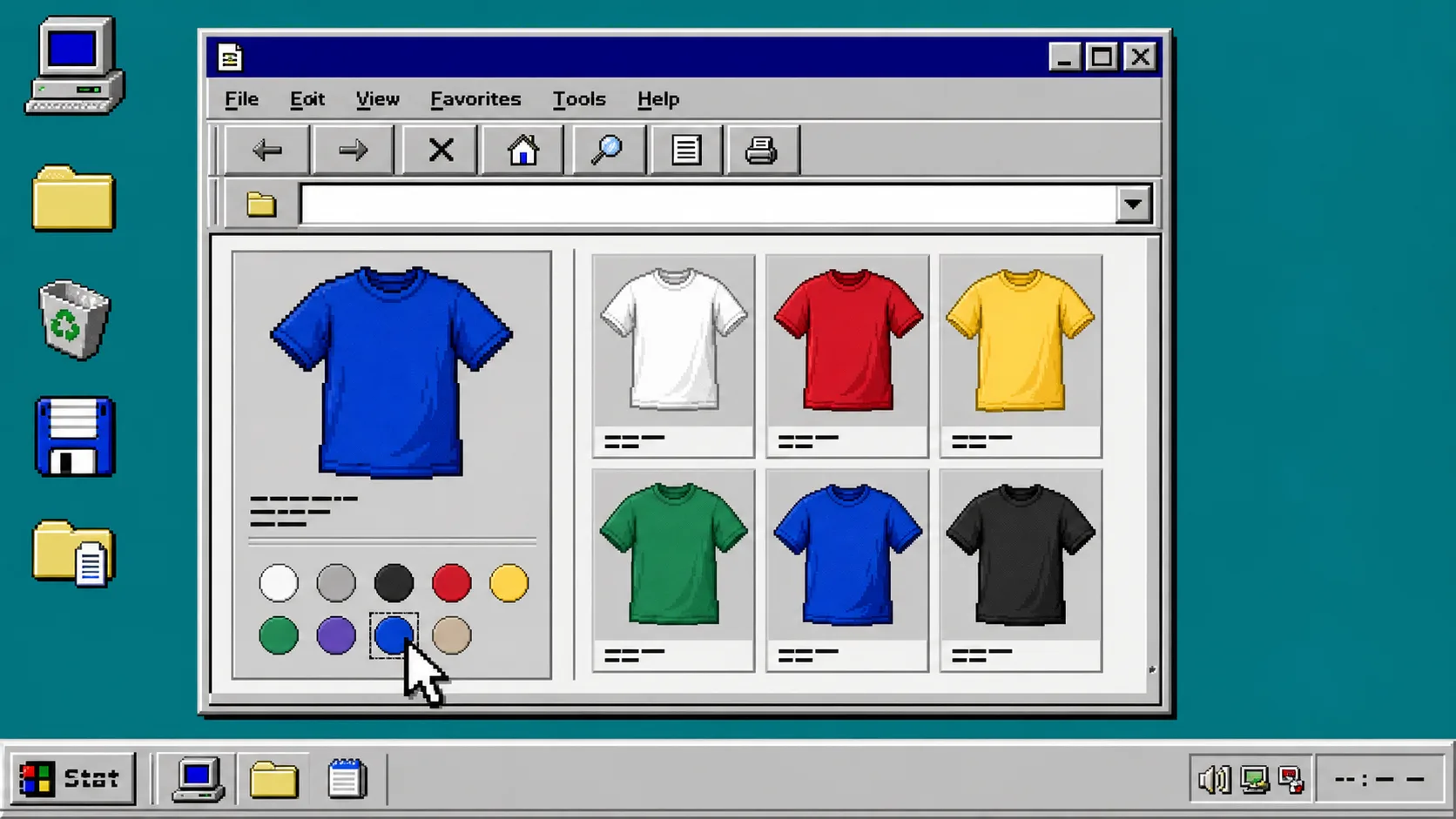
If shoppers cannot tell which color they are choosing, your product options are doing extra work for them. This guide shows you how to set up a small Shopify swatch test, decide whether a color belongs to a variant or its own product page, and check the result before you apply it across the catalog. You need access to Shopify, a few representative products, and Supra Swatch Colors.
1. Pick a small test group
Start with three to five products that cover the awkward cases in your store: one item with ordinary color variants, one family sold as separate color products, and one item with product images that make the color immediately clear. Do not begin with every product. A short test makes it much easier to see which setup is correct.
In Shopify, open Products and write down the product handles and option names you will test. Keep the color option spelling consistent—for example, do not mix Navy, navy, and Blue Navy unless they are genuinely different choices. If you are still choosing an approach, this earlier variant-versus-linked-product decision guide is a useful companion.
2. Choose variants or linked products
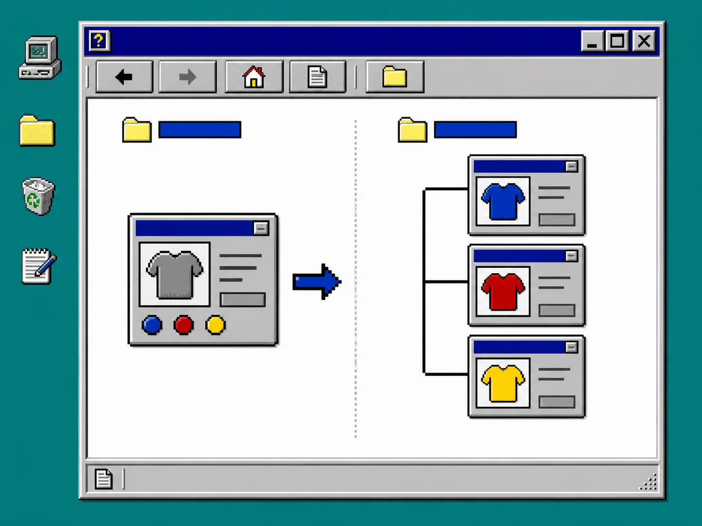
Use variant swatches when the color choices share one product page, the same product details, and the same basic purchasing flow. The shopper should be changing a choice, not starting a new product comparison.
Use linked-product swatches when every color has its own product page, imagery, description, or inventory story. Supra Swatch Colors supports both paths, so you can connect separate product pages with swatches or turn the existing variant option into a visible swatch field. This is especially helpful for a catalog with several product families instead of one giant product record.
For a fuller setup walkthrough, keep the Shopify linked-product swatch tutorial open in another tab. It is better to decide the page structure before styling the circles.
3. Add a swatch style that matches the choice
Install Supra Swatch Colors, then open the app and locate the swatch configuration for your test products. Choose a color swatch for straightforward colors and an image swatch when the surface, print, or texture carries buying meaning. The app can auto-detect store colors or use product images, which is a practical way to get the first pass in place.
Set the swatch size, shape, label, tooltip, and selected state deliberately. Supra Swatch Colors provides more than 20 customizable styles, but the goal is not to use all of them. Use one style that matches your theme and lets a shopper see both the available option and the option they have selected. If you are rebuilding a visual system at the same time, this theme-matching swatch checklist can keep the styling discussion focused.
4. Turn on collection-page swatches for the test
Open a collection that contains the products from step 1. In the app’s collection-page settings, enable swatches for the same test products before turning them on everywhere. Supra Swatch Colors supports product and collection pages without editing theme code, including across Shopify themes and multilingual shops.
Load the collection in an incognito browser window. Click every swatch and watch for three things: the product image changes when it should, the selected option remains obvious, and the product card does not jump or become slow. Collection swatches should shorten the path to the right product, not create a second configuration screen.
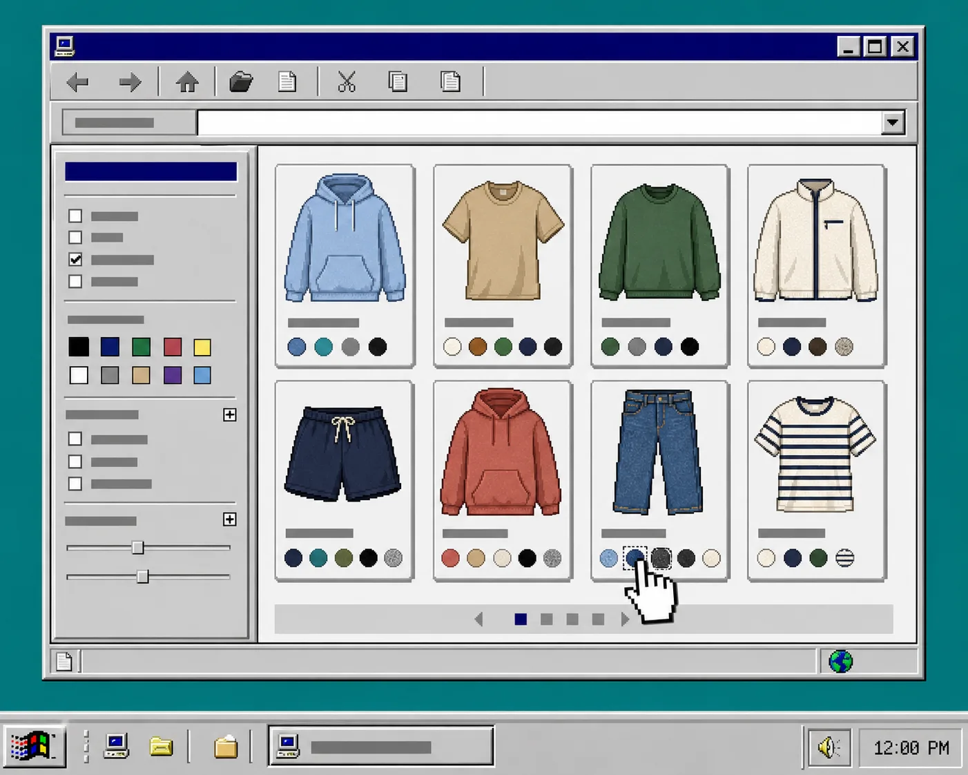
If you need a more detailed collection-page pass, compare the result with this collection swatch setup guide.
5. Run the quality-control check
Before expanding the setup, test each product page and collection card at desktop and mobile widths. Check the following items:
- Confirm every swatch maps to the intended variant or linked product.
- Confirm the selected swatch has a visible border, fill, or other state that does not rely on color alone.
- Confirm image swatches use a useful crop and do not hide a material difference.
- Confirm labels and tooltips are understandable in every published language.
- Confirm the swatches load promptly and still work after a theme preview.
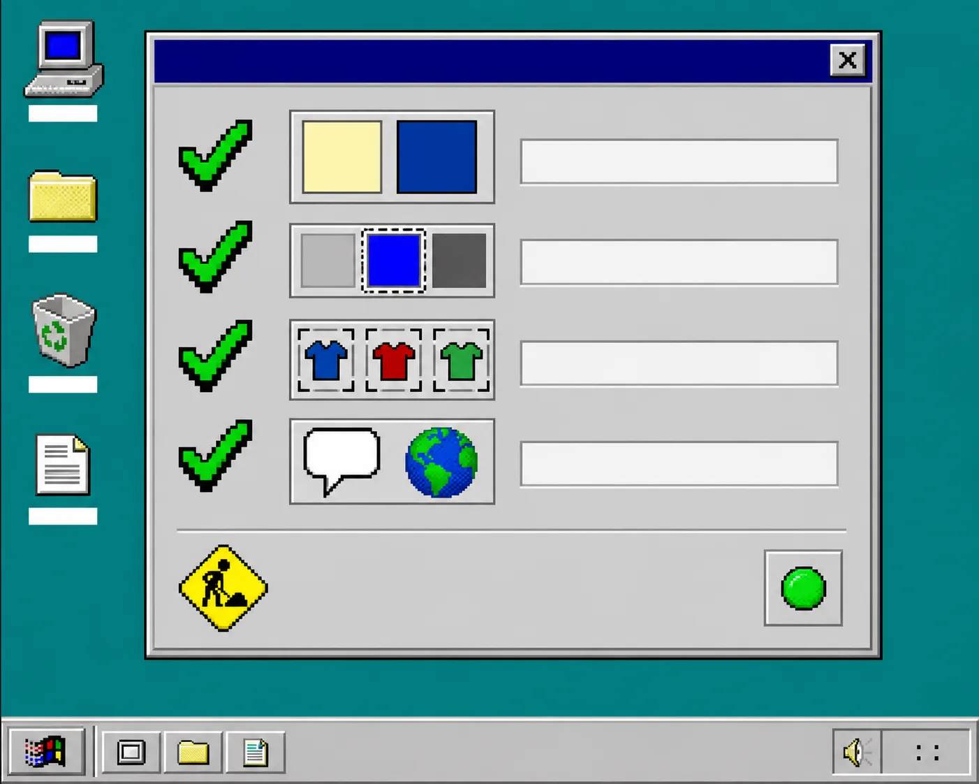
A large catalog needs the same check, just with a representative sample from each family. The multilingual catalog swatch guide explains how to keep that rollout manageable.
Troubleshooting
A swatch points to the wrong item. Recheck whether the product should be a variant or a linked product, then compare its option name and value with the test group. Fix the product relationship before changing colors or CSS.
A color is hard to see. Increase contrast, add a border, or use an image swatch. White, black, and near-identical neutrals need a selected state that remains visible against the page background.
Product pages work but collection pages do not. Confirm that collection-page swatches are enabled in the app and test the live theme, not only the theme editor. The app supports collection-page integration, but your rollout still needs a real storefront check.
The store is multilingual. Review translated labels and tooltips with a native reader before publishing. Do not assume a short color name has the same clarity in every language.
Finish with a controlled rollout
Once the test group passes, add the same configuration one product family at a time. Keep a short list of the products reviewed, the swatch type used, and the collection pages checked. That turns a visual enhancement into a maintainable catalog rule.
Install Supra Swatch Colors to build the test set, then use the getting-started tutorial to make your first swatch group visible. Start with five products, check them on both page types, and only then roll the pattern out storewide.