How to Set Up Linked-Product Swatches in Shopify
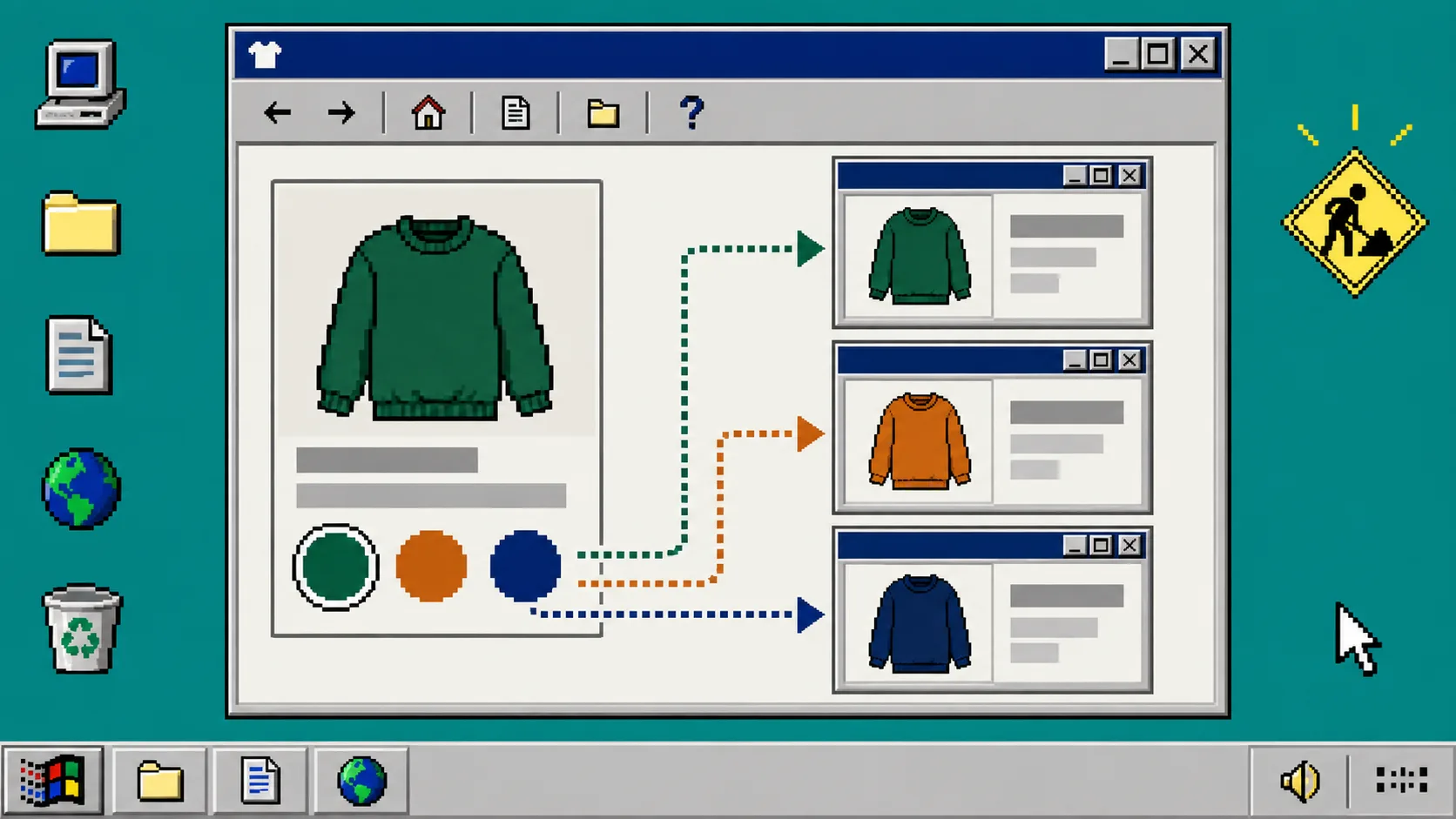
If each color of a product is its own Shopify product, a normal variant dropdown makes shoppers work too hard. They cannot see the available colors at a glance, and they may never discover the other product pages. Linked-product swatches solve that: a shopper clicks a color and lands on the matching product page.
You need three things before starting: separate Shopify products for the colorways, a consistent option name such as Color, and Supra Swatch Colors on the Shopify App Store. The app supports linked products and variants on product and collection pages without editing theme code.
1. Create one product per colorway
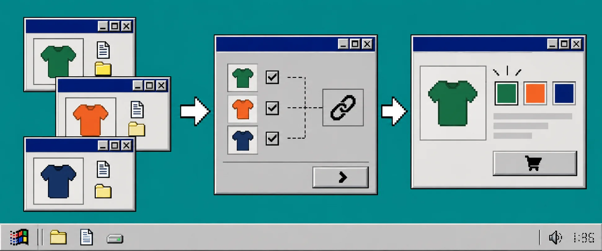
Create a separate Shopify product for every color that should have its own URL, inventory, description, or media. For example, make one product for the green jacket, one for the navy jacket, and one for the orange jacket. Keep the shared information aligned: title pattern, vendor, product type, collection membership, price rules, and size options.
After this step, opening each product in Shopify should show a complete, purchasable product page. Do not link a draft, archived, or unavailable product; a swatch that leads to an unavailable page defeats the point.
Use a naming rule before adding new drops. The method in this Shopify swatch naming guide is useful because it prevents Navy, navy, and Deep Navy from becoming three different colors in your catalog.
2. Install Supra Swatch Colors and choose linked products
Install Supra Swatch Colors, then open the app from Shopify admin. Choose the linked-products swatch workflow rather than a variant-only workflow. This is the important choice: you are connecting separate product pages, not simply changing a variant inside one product.
Add the product group and include every colorway product. Set the display label to Color if that matches your storefront language. Supra Swatch Colors can use automatic color detection or product images to speed up swatch setup, and it supports color and image swatches.
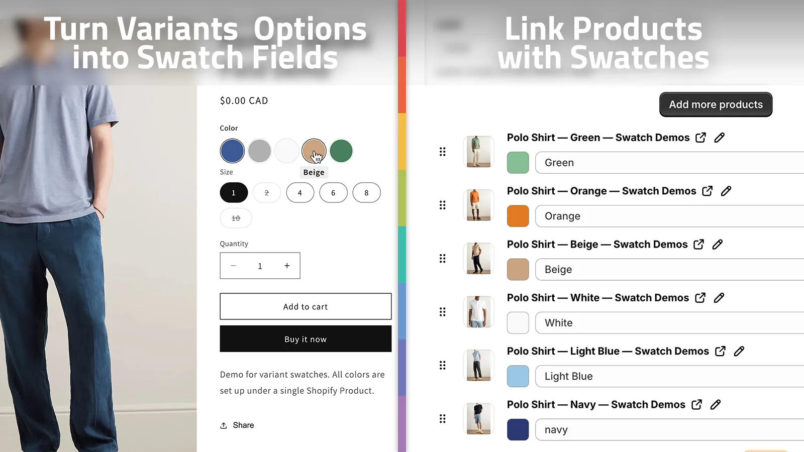
After saving, the group should contain every intended color exactly once. If you sell patterned colorways, use an image swatch when a flat color circle would hide the difference.
3. Configure the swatch appearance
Open the app’s style settings and set the swatch shape, size, label, and tooltip to match the store. Keep the size large enough for a finger tap and give the selected color a visible state. Supra Swatch Colors provides more than 20 style options, so you can match the product page without custom theme work.
Start with simple colors. A small gray circle is not enough distinction between stone, silver, and light gray. Use descriptive tooltips and contrast that remains usable on your product-page background. If the store has multiple languages, check the label and tooltip in every published language.

4. Enable swatches on product and collection pages
Enable product-page integration first. Open a linked product on the live theme, click every color, and confirm that each click changes the URL to the correct colorway product. Then enable collection-page integration and test it in a collection where the group appears.
Collection swatches help people compare colorways before they enter a product page. For layout ideas, see how to make collection pages easier to scan with color swatches. Do not assume a collection layout proves the links work; test the clicked destination too.
5. Run a short preflight before publishing
Check the following on desktop and mobile:
- Click every swatch from every product in the group.
- Confirm the destination product has the correct images, price, and stock.
- Confirm the selected color is obvious after navigation.
- Open the collection page and confirm the swatches do not overlap product titles or buttons.
- Switch storefront languages if you use them.
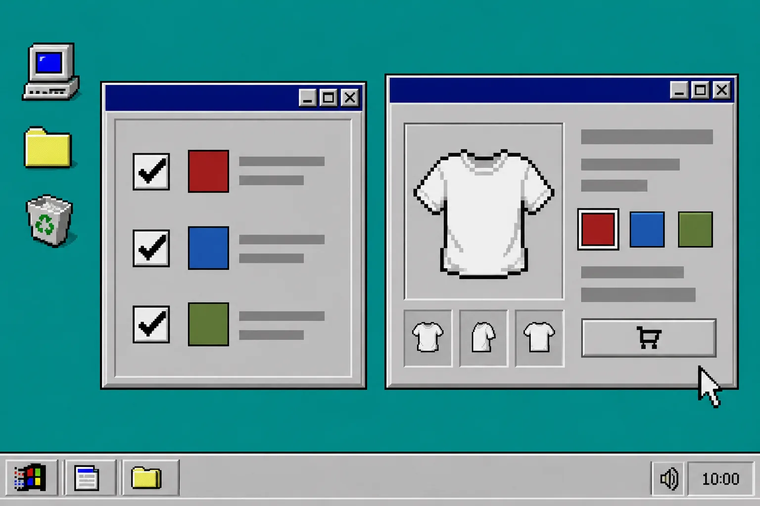
Treat this as part of normal product-page QA. If your catalog also needs consistent information blocks, organizing content with tabs and accordions keeps specifications, shipping, and care information from competing with the color choice. Apparel stores should also validate that a chosen colorway still exposes the correct fit guidance; this size-chart workflow is a helpful companion check.
Troubleshooting
A swatch goes nowhere. Confirm that the linked product is active and is included in the app’s product group. Save the group again, then test from an incognito window.
The wrong color is selected. Check for duplicate product entries or mismatched color names. Standardize the color values and assign one swatch per product.
Swatches are missing on a collection page. Confirm collection-page integration is enabled in the app and test a product card that belongs to a completed group. Theme caching can make a recent setting change look absent, so use a fresh browser session.
The swatches look crowded. Reduce the number of visible swatches only after making sure the remaining colors are discoverable. A tooltip, consistent size, and clear selected state are usually better fixes than tiny circles.
Recap
Linked-product swatches make separate colorway products feel like one coherent choice instead of a maze of near-duplicate listings. Create the colorway products, group them in Supra Swatch Colors, set a clear visual treatment, then test every destination on product and collection pages.
Your next step: install Supra Swatch Colors and build one small product group first. Once that group passes the preflight, repeat the same naming and QA pattern for the rest of the collection.