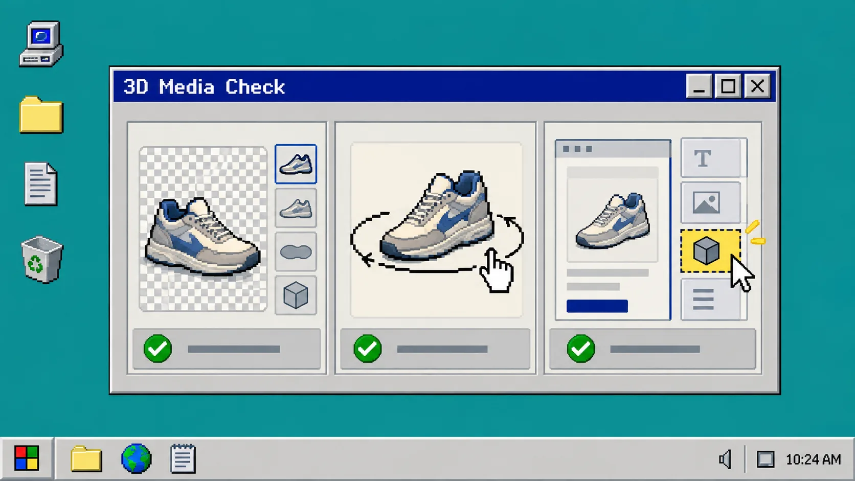
Your Shopify theme does not need a custom 3D build before you try a product model. You do need to confirm that the theme can show product media clearly, that the model appears in the right place, and that shoppers can use it on a phone. This guide gives you a short compatibility check before you spend time capturing a SKU.
You will need access to Shopify admin, your theme customizer, and one test product. If you do not have a GLB yet, you can still complete the theme checks first; Supra 3D Capture can turn a guided set of phone photos into a web-ready model when you are ready.
1. Open a Duplicate Theme First
Open Online Store > Themes in Shopify admin. Find the theme you want to test, choose the three-dot menu, then choose Duplicate. Label the copy something clear, such as 3D media test.
Use the copy for the first pass. This keeps an experimental app block or product-media setting away from your live storefront. It also makes the test easier to undo. If you are still choosing a first item, start with the short scoring approach in I Chose My First Shopify 3D SKU With a Five-Minute Scorecard.
2. Check the Product Media Area
In the duplicated theme, choose Customize, then open the product template for your test product. Look for a Product information or Product media section. The important question is simple: does the product gallery have enough space for a shopper to see an interactive object without covering the price, variant picker, or Add to cart button?
Do not judge this by a tiny editor preview alone. Change the preview to desktop width and mobile width. A good 3D placement keeps the main media area near the top of the page and lets a shopper return to the regular product images without losing their place.
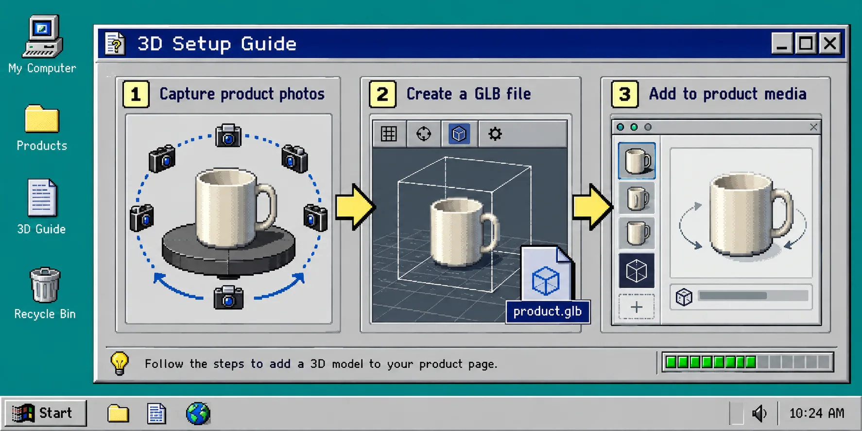
3. Add One Test Model to Product Media
Create or obtain one test GLB. With Supra 3D Capture, the workflow is: take a guided orbit of phone photos, let the service process them, then publish the resulting model into Shopify product media. The app also provides an Online Store 2.0 theme app block if a dedicated placement suits your layout.
Attach the test model to the product in Shopify. Return to the product page preview and check that the model appears as a selectable media item. You should see a clear visual indicator that the item is interactive, not a flat replacement for every product photograph. Keep the normal photos; the model should answer shape and proportion questions that photos leave open.
For capture setup before this step, use How to Set Up Phone Lighting for Shopify 3D Capture. Good lighting and a stable orbit make the theme check more meaningful because you are testing a model a real shopper could inspect.
4. Test the Theme’s Interaction, Not Just the File
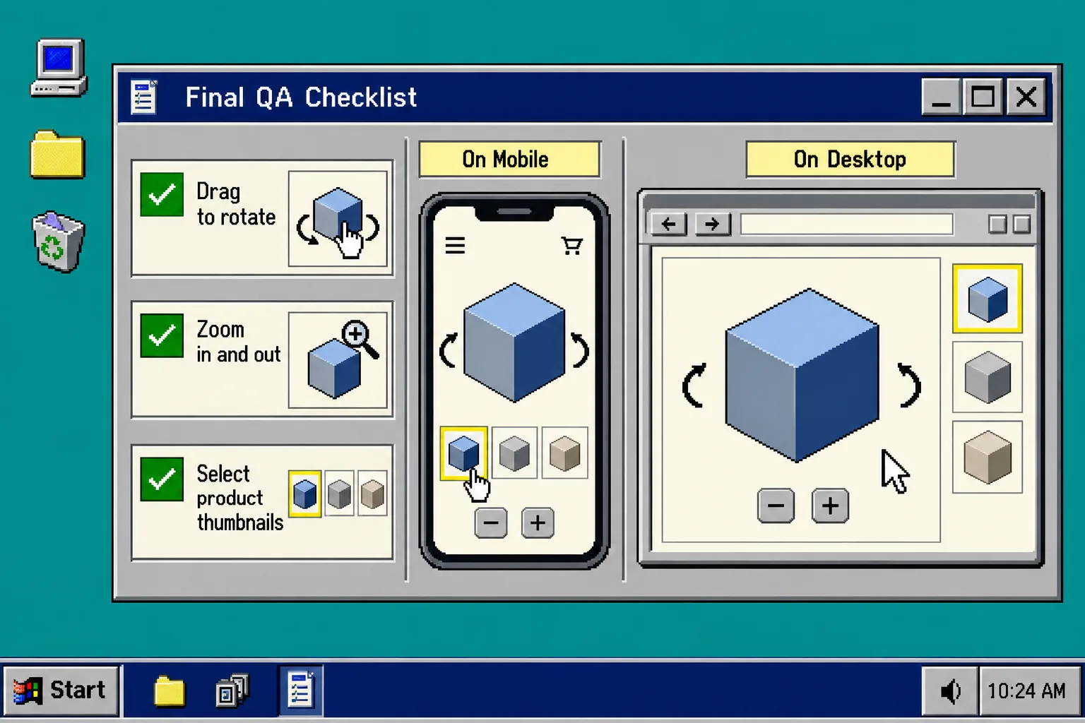
Open the preview in a normal browser window. Drag the model, rotate it, and switch back to image thumbnails. Then repeat on a phone. On a working setup, the model loads in the product media area, accepts touch or mouse interaction, and does not trap the shopper in an awkward full-screen state.
Check these three details while you test:
- The 3D item is visibly different from still images.
- Dragging or swiping changes the view without moving the whole page unexpectedly.
- The Add to cart control remains easy to find after the interaction.
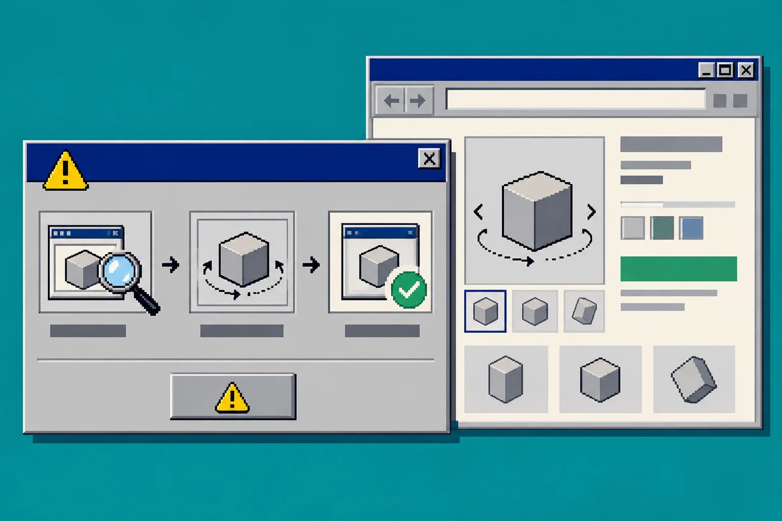
5. Use an App Block Only When It Improves the Page
A native product-media placement is usually the cleanest first option. Add a dedicated app block when you want the model lower on the page, beside a materials explanation, or within a product-story section. In the theme customizer, choose Add block, select the Supra 3D Capture block, and move it one section at a time.
After each move, preview the page. Stop if the block repeats the same model too close to the native gallery. The goal is useful inspection, not two competing viewers. If your product is difficult to reconstruct because it is shiny, clear, or fuzzy, plan for a smaller capture test before redesigning the page around it. The catalog-first thinking in I Audited My Shopify Catalog Before Capturing a Single 3D Model is a useful way to choose that test.
6. Run a Mobile and Return-Expectation Check
On a real phone, use the model as a shopper would. Rotate it to the back, zoom only as far as the viewer allows, tap nearby thumbnails, and add the product to cart. Check load behavior on cellular data if possible. A model that works only on a wide desktop screen is not a complete product-page improvement.
Ask one final question: what uncertainty does this model remove? It may show the depth of a bag, the base of a lamp, the texture of a shoe sole, or the proportions of an object that looks misleading in a front-facing photo. This is why 3D works best as part of a clear media set rather than as a novelty. For a broader planning pass, see How I Plan Shopify 3D Capture for Products That Need It.
Troubleshooting
The model is attached but not visible. Re-open the product media list, confirm the saved product is the one used in the theme preview, then publish the duplicated theme only after the item appears correctly.
The viewer is visible on desktop but awkward on mobile. Reduce nearby blocks, confirm the product media section is not constrained by a custom width setting, and test the theme’s normal product template before adding more custom code.
The model looks poor even though the theme works. Treat that as a capture problem, not a theme problem. Re-shoot with even light, a clean background, and consistent photos around the item.
Next Step
Once the preview works on both desktop and mobile, choose one high-explanation SKU and make the duplicate theme live. You can start with the Supra 3D Capture Shopify app listing to create a phone-photo test model, then use this same checklist before rolling 3D media across the rest of the catalog.