
Your product page can keep all of its useful information without asking shoppers to read one long description wall. The result is a product template that shows named sections as tabs where there is room and as accordions where the page column gets narrow.
You need a Shopify store, product information you can separate into sensible topics, and one product template you can edit. This guide uses Supra Tabs & Accordions, a free Shopify app with no trial, tiers, or card requirement. It changes how information is presented; it does not replace the product data you already maintain.
1. List the questions your product page has to answer
Open a representative product in Shopify and read its description from the shopper’s point of view. Mark each distinct question: what is included, what are the dimensions, how does it fit, what materials or ingredients apply, how is it cared for, is it compatible, and when does it ship? Do not make a tab merely because a paragraph exists. Make one when a shopper would reasonably look for that topic on its own.
Keep the product name and short buying explanation at the top of the page. Move supporting details into separate headed sections. A clothing catalog might use Size & Fit, Fabric & Care, and Shipping. A technical catalog might use Specifications, Compatibility, and Downloads. If color is important, use a clear color label too; the setup ideas in this Shopify color-swatches guide complement a more readable detail area.
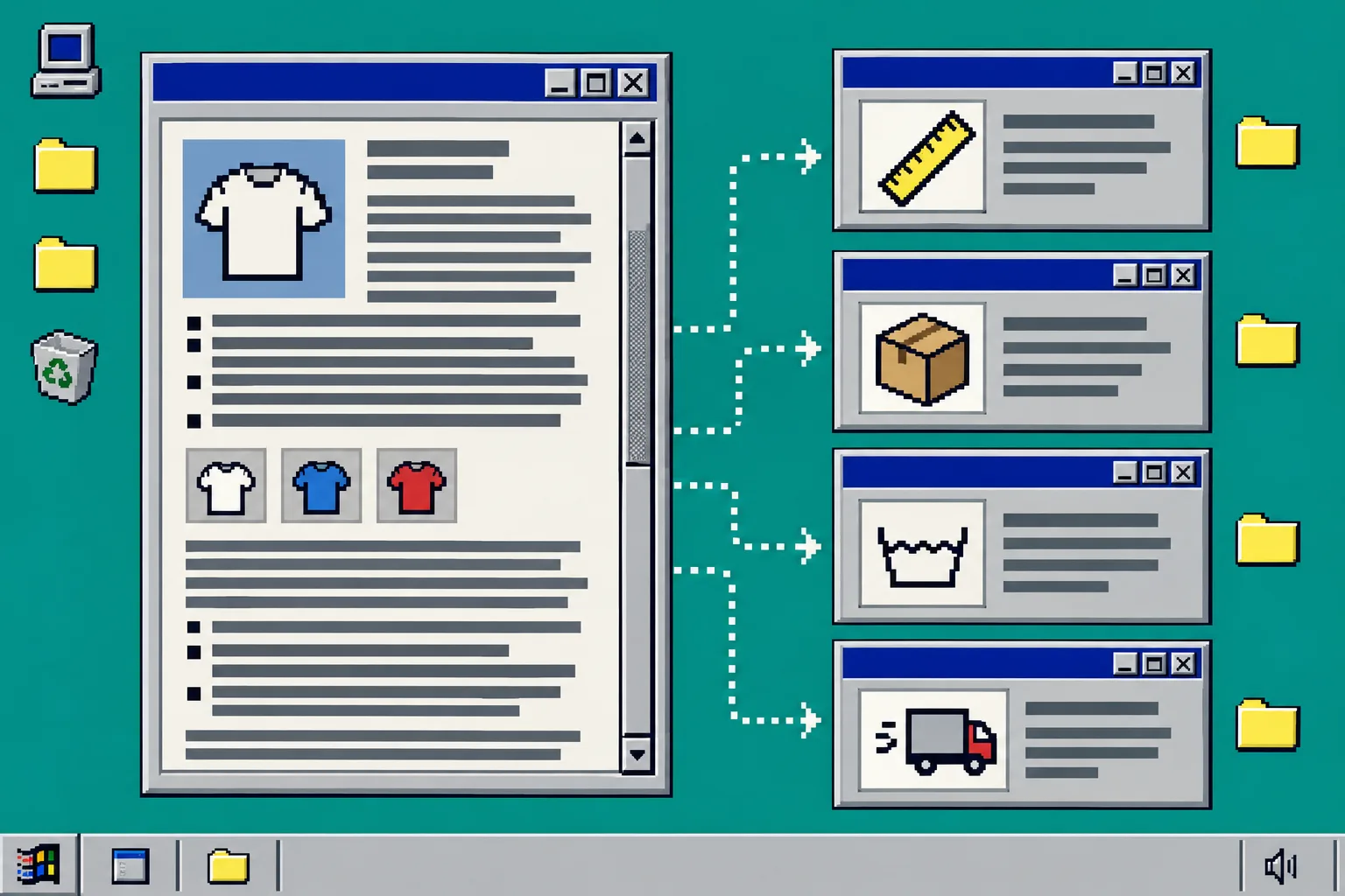
2. Choose the right source for each section
In Supra Tabs & Accordions, create a tab set and add one tab for each useful topic. For every tab, choose the source that matches the ownership of the information:
- Use the product description for details unique to each product.
- Use a per-product metafield for structured specifications, ingredients, or care notes.
- Use a store page for shared policies such as shipping, returns, or warranty terms.
- Use a metaobject field when the same structured record belongs to many products.
- Use an image, download, or written content when a visual diagram, manual, or short explanation does the job better.
This distinction is what keeps the setup maintainable. Edit a shared shipping page once instead of pasting it into fifty descriptions. Keep measurements in a product metafield so the correct values travel with the product. Empty tabs hide automatically when a product has no matching content, so one tab set can safely cover a collection with a few exceptions.
If you are standardizing apparel details, pair this with a consistent measurement format; showing centimeters and inches in a Shopify size chart is a useful next cleanup.
3. Set desktop tabs and mobile accordions deliberately
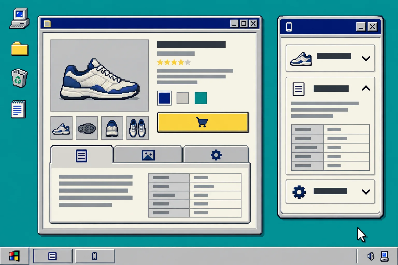
Open the tab set preview. On a wide product-page column, tabs make nearby topics easy to scan without making the page very tall. On a narrow column, accordions preserve that organization while giving each heading a comfortable tap target. Supra Tabs & Accordions responds to the actual product-page column, not only the browser width, so test it inside the template rather than judging from a desktop browser window alone.
Choose a tab overflow behavior before you add too many labels. Horizontal scrolling, a More control, wrapped rows, and stacked sections solve different layout problems. Keep labels short enough to recognize at a glance. The app includes keyboard support, appropriate roles, reduced motion, and direct links that can open a particular tab; still, check that your labels describe the content instead of sounding clever.
4. Target the tab set to the right products
Choose how the set should apply: collection, tag, vendor, product type, or specific products. Use a collection or tag when the rule should also cover future matching products. Use selected products for a limited exception.
Before saving, check the live preview, the match count, and any overlap warning. When more than one rule could match, the app identifies which set wins. Resolve that choice now, especially when you have a general collection set and a more specific product set. This is the same small-scope habit that makes catalog changes safer; test a bulk edit before updating an Etsy catalog shows why a controlled sample is worth the extra minute.

5. Add one app block to the product template
In Shopify, open Online Store > Themes > Customize. Switch to the product template that should display the information. Add the Supra Tabs & Accordions app block where shoppers naturally look for product details, usually below the title, price, options, and short description. Save the template, then open a few products that match the rule.
You should see the same named content system with the right product-specific values. Test a product with a missing optional field and confirm its empty tab is hidden. Test the page at a narrow width and with a keyboard. Then use a direct tab link in a support reply or product guide only after confirming it opens the expected section.
Troubleshooting
All products show the same specification. Check the tab source. A shared page is correct for a policy; a product metafield or description is better for product-specific data.
A tab is missing. Confirm the product matches the targeting rule and that its selected content source has a value. Empty tabs are intentionally hidden.
Two sets appear to compete. Return to the tab set preview and inspect the overlap warning. Decide which rule should win instead of relying on the order you happened to create them.
The mobile layout feels crowded. Shorten labels first, then change the overflow behavior. If the topic needs a table or long instructions, an accordion may be a clearer default.
Wrap-up
A well-organized product page does not need less information; it needs information that shoppers can find. Start with one high-traffic collection, split its details by question, connect each section to the correct Shopify source, and test the result in the product template.
Install Supra Tabs & Accordions from the Shopify App Store and build one reusable tab set before you touch every individual product description.