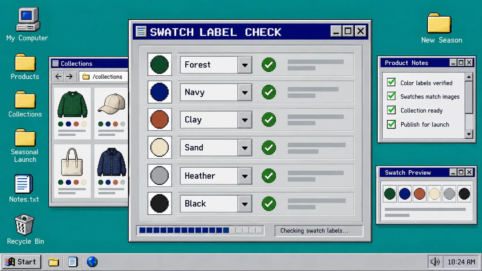
A color launch can go wrong before anyone clicks Add to cart. The usual problem is not the swatch itself; it is the loose catalog data behind it. One product says “Forest,” another says “Forest Green,” and a collection card shows an image that looks closer to navy. Shoppers then have to guess whether they are seeing a new option, the same option, or a different product.
This guide gives you a small pre-launch audit for Shopify color swatches. You need access to your product data, a short list of the colors being released, and a test device. If you use Supra Swatch Colors, open its swatch and product-group settings before you begin. The app supports both variant color options and linked product pages, plus swatches on product and collection pages without theme code.
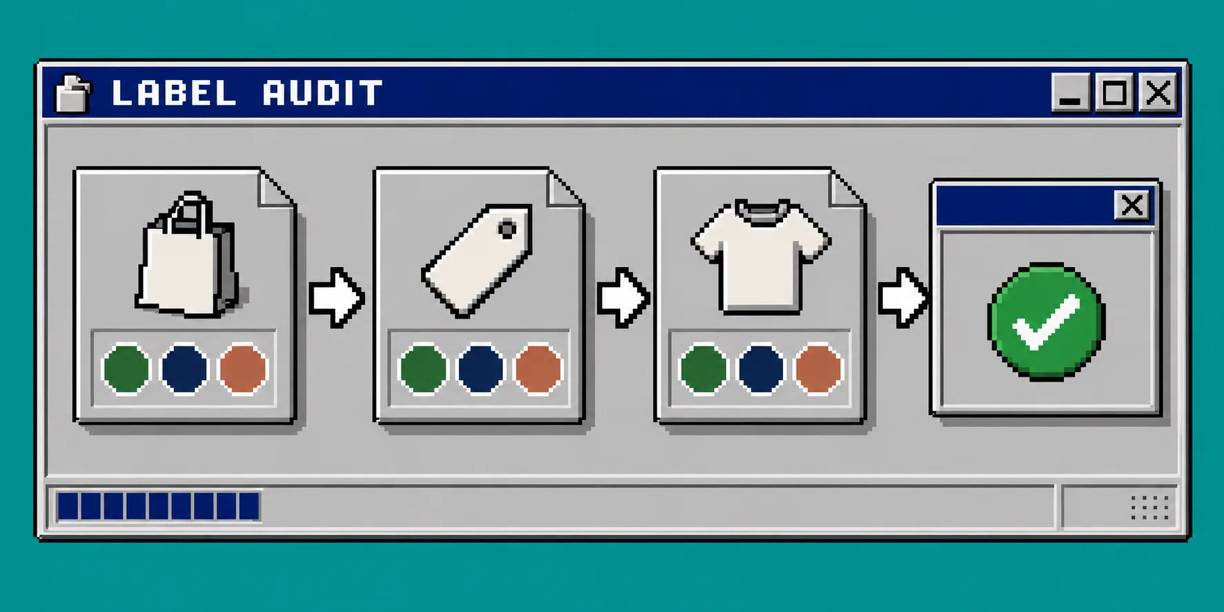
1. Make one source-of-truth list for launch colors
Start with a plain list, not your storefront. For every incoming color, record the shopper-facing label, the Shopify option value, the product family it belongs to, and the image you expect to represent it. For example, decide whether the public name is Forest or Forest Green; do not allow both unless they mean different colors.
Keep the public label short enough to read in a tooltip and specific enough to distinguish nearby shades. Avoid internal abbreviations such as FW26-FRST-02. If you sell in more than one language, decide which labels need translations before the swatches go live. Supra Swatch Colors supports multilingual shops, but it cannot make an inconsistent naming convention consistent for you.
After this step, each launch color should have one approved spelling and one intended visual reference. This is the same foundation you need when you set up linked-product swatches: a swatch needs to point somewhere unambiguous.
2. Choose whether each color is a variant or a linked product
Open a representative product family and answer one question: does a color change only the selectable option, or does it deserve its own product page?
Use a variant when the colors share the same product description, media strategy, price, and inventory model. Use linked products when a colorway has its own photography, merchandising copy, URL, or inventory story. Do not create linked products merely because there are many colors; create them when the shopper needs a genuinely different product page.
For the chosen structure, make the option value exactly match the approved label from step 1. Then set the swatch source deliberately: use a color chip when the shade is simple and stable, or use a product image when texture, print, or material matters. The product’s setup flow can auto-detect store colors or use product images, so you can keep that choice consistent across the family. If you need the underlying setup mechanics, use the earlier variant and collection-page guide.
3. Check the product page at the decision point
Open the product page in a private browser window. Select every launch swatch and verify four things: the visible label changes correctly, the selected state is clear, the destination or variant is correct, and the image does not contradict the swatch.
Do this on desktop and mobile. A swatch that looks comfortably spaced on a wide screen can become a tiny unlabeled dot on a phone. Check tooltip text, swatch size, shape, and the distance between options. Supra Swatch Colors includes more than 20 style options, so set an intentional treatment instead of accepting whatever was used on a previous collection.
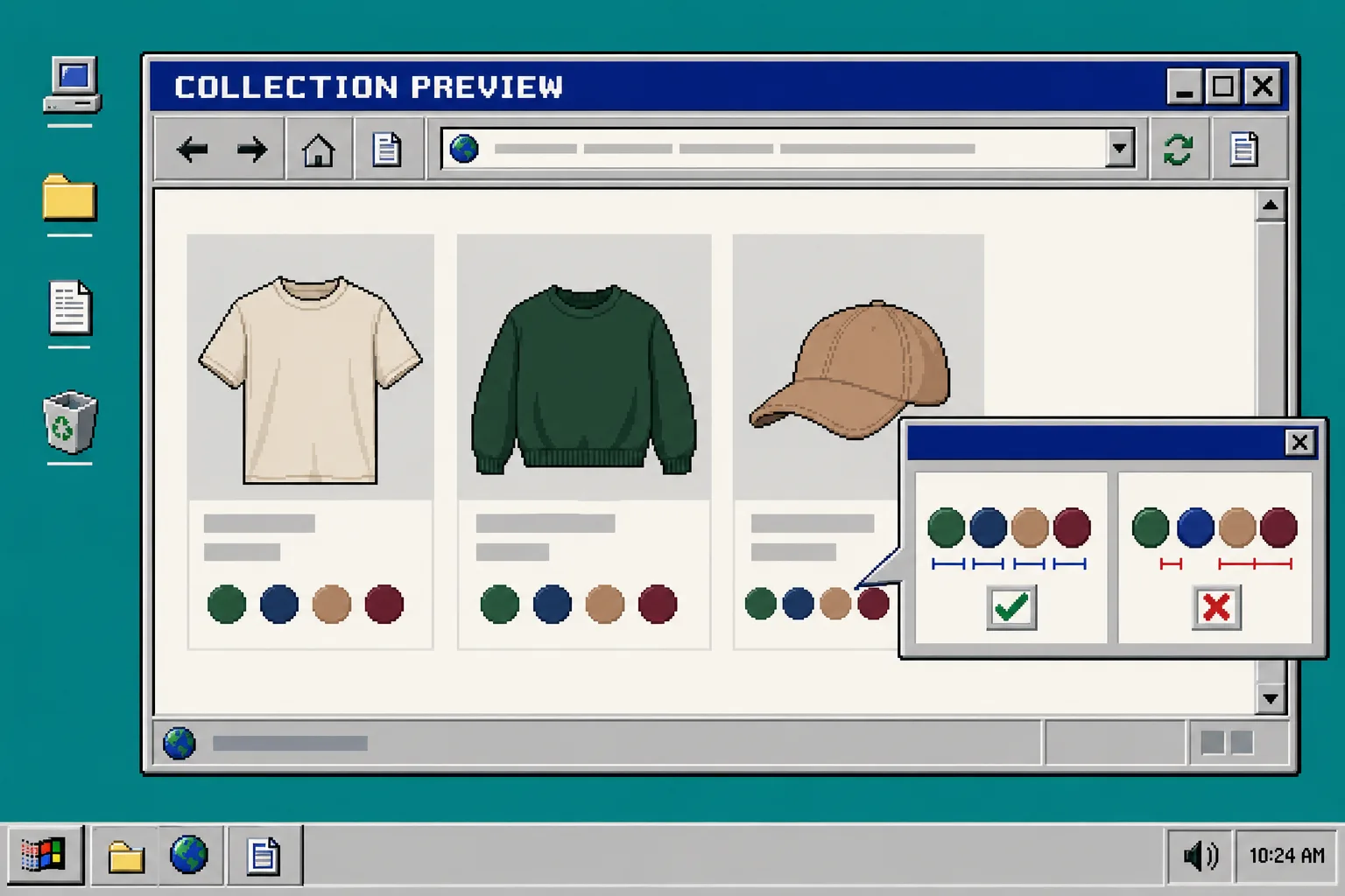
4. Preview the collection page before traffic arrives
Next, visit the collection where shoppers will browse the launch. This is where inconsistent naming becomes expensive: cards may show different swatch counts, a linked product can open the wrong page, or a color can disappear because it was only configured on the product page.
Scan at least three products from the same family and three from different families. Confirm that swatches appear consistently, that colors are not duplicated under two labels, and that each color gives a useful route to the intended product or variant. For a focused collection-page check, compare your results with this guide on adding color swatches to Shopify collection pages.
Take screenshots of any mismatch and fix the catalog value first. Styling should be the last adjustment, not the first.
5. Save a reusable launch checklist
Turn the audit into a short recurring task: approved label, correct option or product link, correct image source, product-page test, collection-page test, and mobile check. Reuse it whenever a color is renamed, a product family is expanded, or a translated storefront is updated. That prevents your catalog from drifting one small exception at a time.
Troubleshooting
Two swatches look identical. Check whether the labels describe genuinely distinct shades. If they do, use product images or revise the naming so shoppers can tell the difference.
A swatch opens the wrong product. Re-check the product group and linked-product mapping, then test again from the collection card as well as the product page.
The product page is correct but the collection is not. Confirm that collection-page swatches are enabled and test a clean browser session; avoid assuming a cached preview reflects the current setup.
A translated storefront shows inconsistent color names. Audit the public labels in each language before changing visual styles. A polished chip cannot repair a mismatched translation.
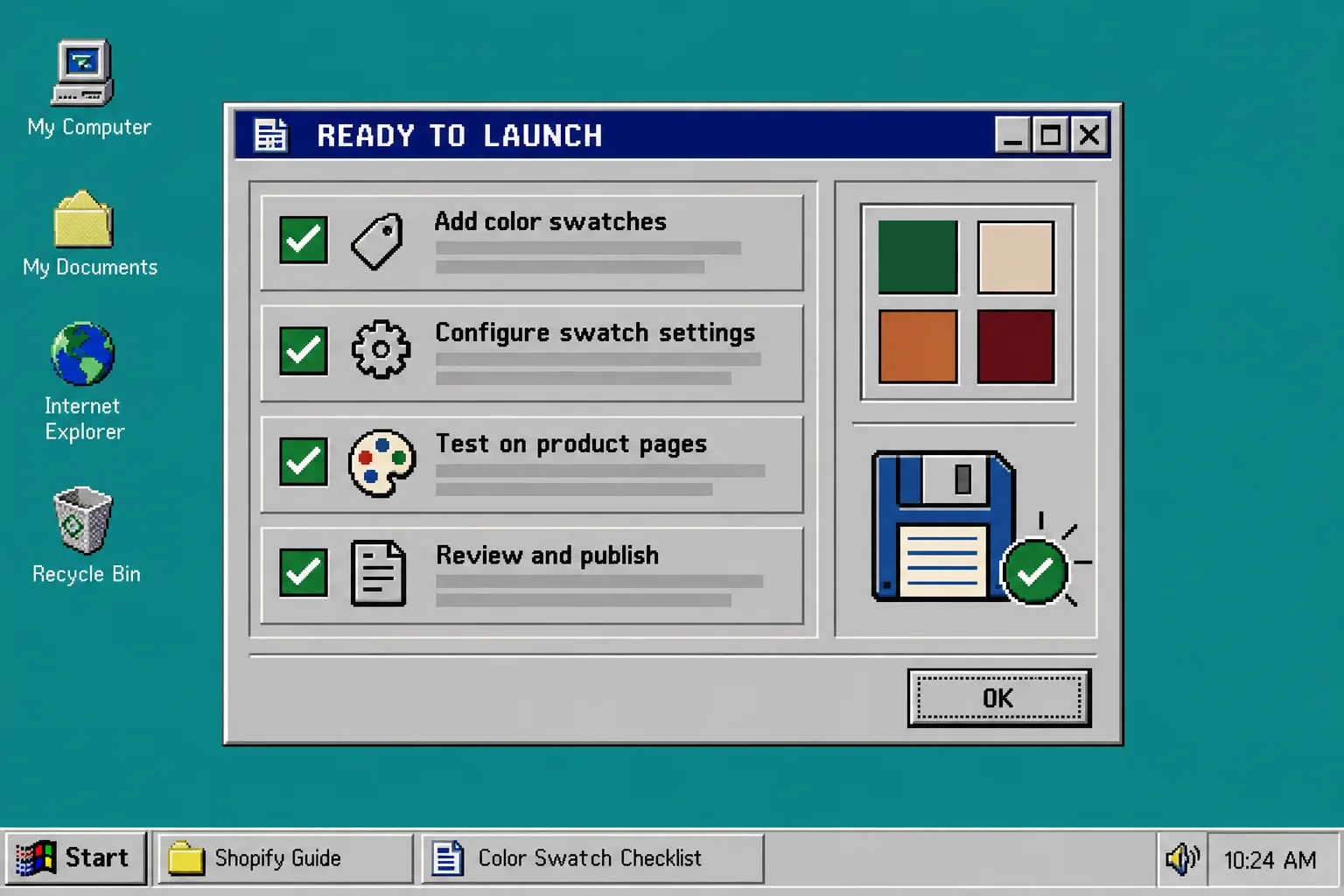
Ready for launch
A good swatch system makes color selection feel obvious: one name, one visual cue, and one correct destination. Before your next color drop, run this audit on a small product sample, then roll the confirmed pattern across the catalog. Install Supra Swatch Colors to manage color and image swatches for variants, linked products, and collection pages without editing theme code.
For one more implementation reference, see how to link separate Shopify products with color swatches.