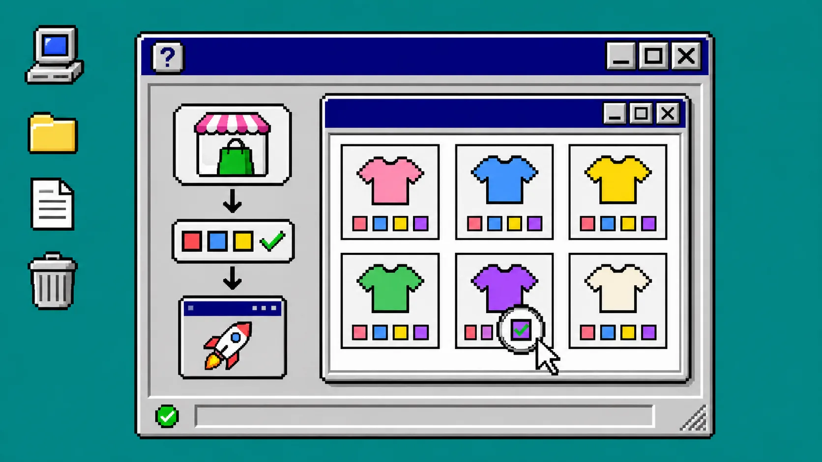
A collection-page swatch check is a small regression test: open a representative collection, click every displayed color path, and confirm that the card, URL, price, and availability still agree. Run it after a theme edit, app setting change, product import, or color-name cleanup—not after customers report it. You need a published theme preview, a desktop browser, and a short list of products that represent your catalog.
Supra Swatch Colors can show color and image swatches for variants and linked products on product and collection pages. The useful part here is not the decoration; it is giving shoppers a visible route to the right purchasable item.
1. Build a five-card test tray
Create a private note named collection-swatch-check and add five product URLs: a single-color product, a two-color variant product, a linked-product color family, an out-of-stock color, and a product with a long localized color label. These are your regression cards. Shopify variants represent combinations of option values such as size and color, and inventory can be managed per variant, so the test must exercise combinations rather than only the first swatch you see. Shopify’s variants guide is a good refresher before changing the catalog.
Record the expected result for each card: visible swatch count, expected destination or selected variant, price, and stock state. Do not try to validate hundreds of products manually; validate this tray after every relevant change, then rotate two cards each week.
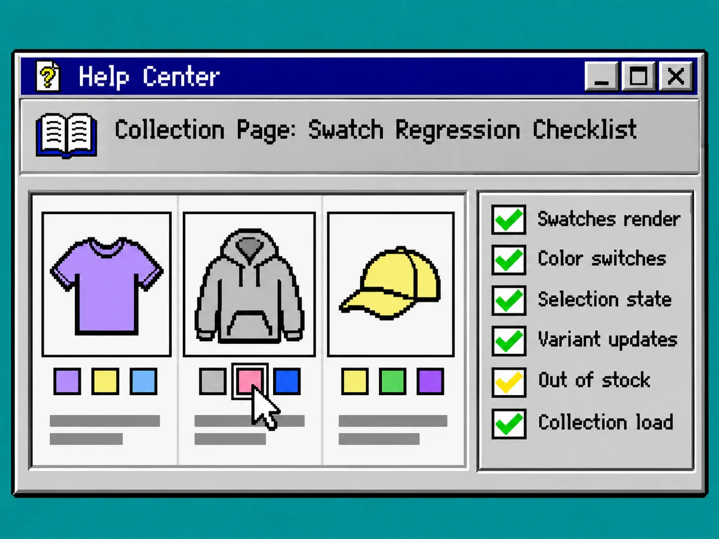
2. Open the exact collection context
Open the published collection in an incognito window. Test the collection template that real shoppers use, not only a product page or the theme editor. If your storefront has different collection templates, test the one with the largest assortment first.
Confirm that each product card has the expected color affordance and that a swatch is not mistaken for a filter chip. If you recently changed product options, compare the labels against the standardized color names from this color-name setup guide. A label mismatch is often catalog data, not a front-end rendering bug.
3. Click a full color path, not one pretty swatch
For each tray card, click every available color swatch and write down what changes. A pass requires the selected swatch to lead to the expected variant or linked product, display the appropriate image when your setup uses one, and keep the price and availability truthful.
Use this decision table while testing:
| What happens after the click | Treat it as | Next action |
|---|---|---|
| URL or selected variant changes and the card matches | Pass | Record the path |
| Image changes but price or stock is wrong | Variant-data issue | Check the selected variant in Shopify Admin |
| Card changes to the wrong product | Grouping issue | Review linked-product swatch mapping |
| Click does nothing | Display issue | Check the app embed and collection template |
| Unavailable color looks purchasable | Merchandising risk | Correct stock behavior before launch |
This is different from deciding whether a color deserves its own product page. For that catalog decision, use the checklist in When Should a Shopify Color Be a Separate Product Page?. Here, you are checking whether the choice you already modeled survives the collection view.
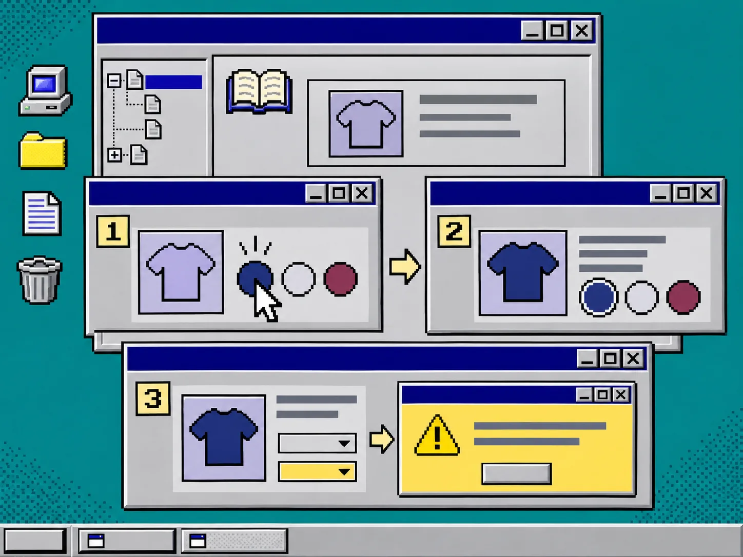
4. Test the awkward states deliberately
Select the out-of-stock color in your tray. Then reduce the browser width until the product grid changes columns. Finally, repeat one path with the storefront’s second language if you publish one. These three states catch the errors that a calm desktop click-through misses: stale availability, wrapped swatches, and translated labels that no longer map to the intended option.
For keyboard access, tab to a swatch and activate it with the keys your theme supports. The goal is not to certify accessibility from one test; it is to ensure a recent color change did not remove a previously usable path. The broader pre-launch routine in How I Test Shopify Color Swatches With a Keyboard Before Launch is a useful companion.
5. Fix the smallest layer first
When a card fails, do not immediately edit theme code. First identify whether the error exists in product data, the swatch grouping, the app configuration, or the collection template. Supra Swatch Colors documents support for variant and linked-product swatches as well as collection pages, so verify which model the failing card uses before changing its configuration.
If the fault appears only after a theme release, compare the published and preview templates. If it appears on every collection but product pages work, check the app embed and collection-page integration. If only one color family fails, return to that family’s product data. This same scope-first habit is useful when hiding empty Shopify product tabs: a blank or broken result does not automatically mean the theme needs a rewrite.
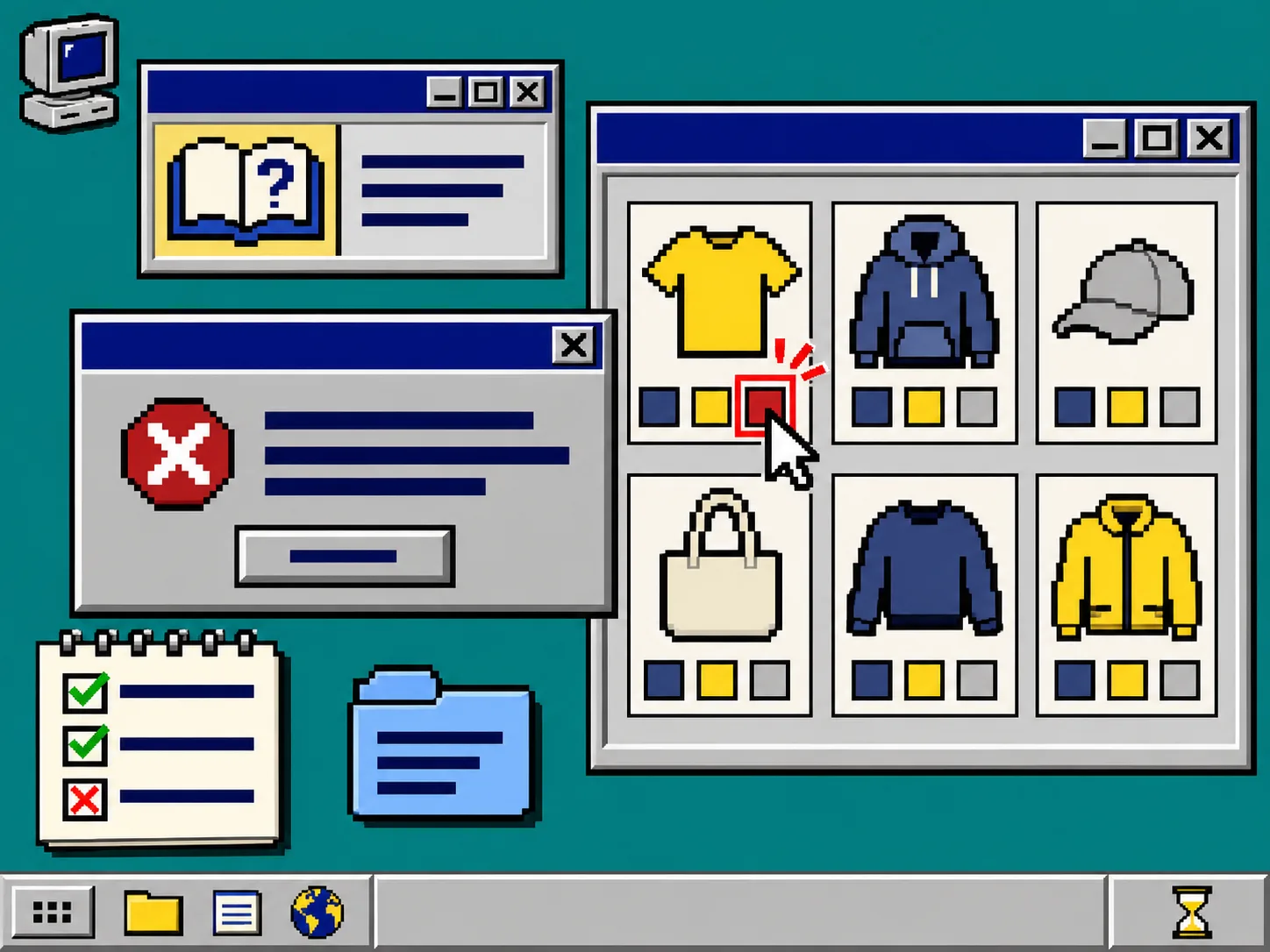
Troubleshooting: what to inspect when the check fails
A swatch is visible but opens the wrong color. Review the linked-product grouping and confirm the product card URL is the intended destination.
The swatch appears on product pages but not collections. Inspect the collection template and app embed before editing product options. Collection and product integrations are separate display contexts.
The color is selectable but unavailable at checkout. Check the exact selected variant’s inventory and availability, then rerun the test in an incognito window.
A new import changed only some labels. Normalize the incoming option values first. Do not compensate with a one-off visual label that will break the next import.
Keep the receipt with the release
Save the five-card results beside the theme release: date, collection URL, card URLs, browser width, and any failure you corrected. That gives the next teammate a compact answer to “did swatches work before this deploy?”
If you want swatches on collection pages without starting with theme-code surgery, install Supra Swatch Colors, configure one representative color family, and run this five-card check before rolling it across the catalog. The next action is simple: choose your five cards now and make the tray part of your next release checklist.