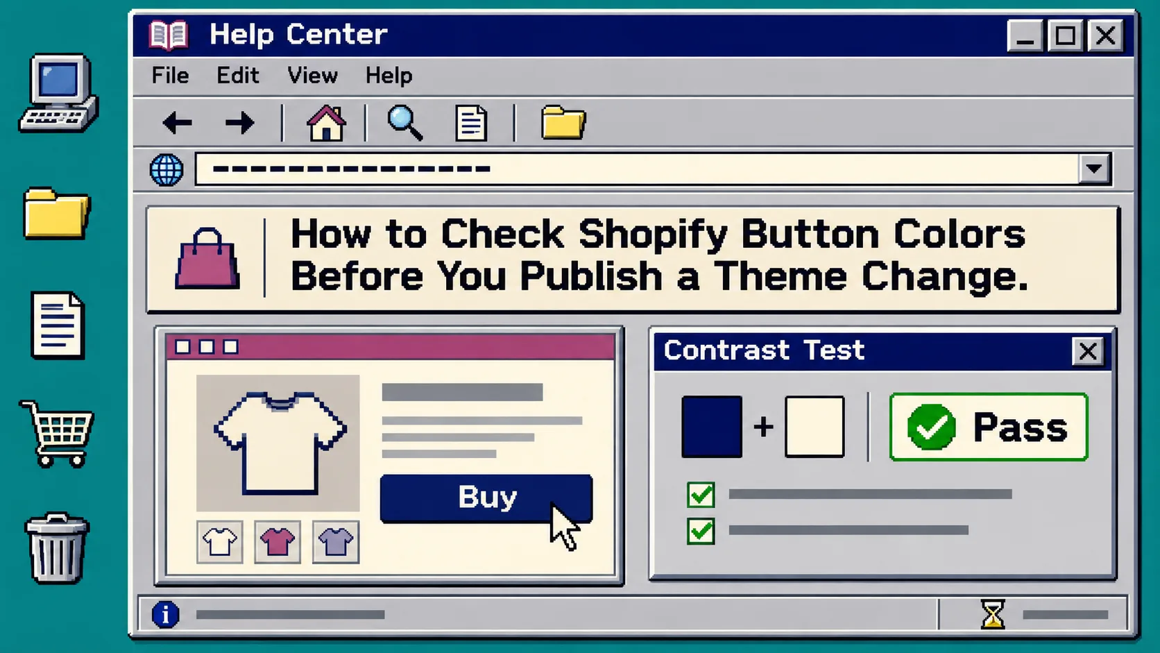
How to Check Shopify Button Colors Before You Publish a Theme Change
Before you publish a Shopify theme change, test each button’s foreground and background colors as a pair—not as a palette swatch. A quick browser check can confirm whether the text meets WCAG contrast thresholds, but you still need to review the button in its actual size and state. You need your theme preview, the intended hex values, and a tool such as Tiny Online Tools’ Color Contrast Checker.
That matters because a nice-looking sale color can leave an Add to cart label difficult to read, especially on a phone or when the button changes on hover. The checker reports the ratio and the AA/AAA results for normal and large text; Shopify’s theme editor is where you confirm the result still makes sense in the storefront.
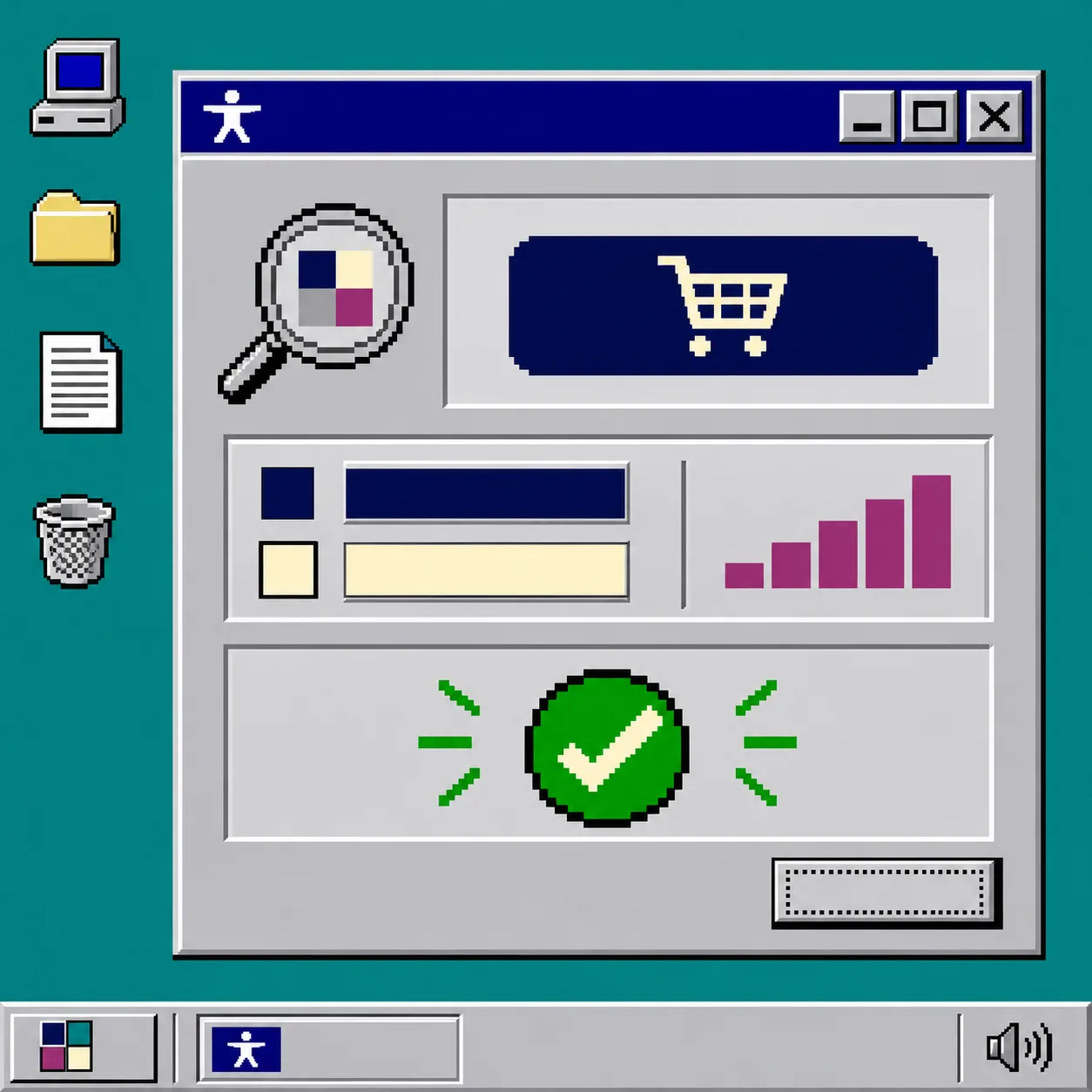
1. List the button pairs you are actually changing
Start with a short inventory. Do not test only the main product button and assume the job is done. In Shopify, record the background and label color for every edited pair: primary call to action, secondary button, cart or checkout-adjacent action, and any sale banner button. Then add its hover, focus, disabled, and inverse-on-dark-background states if your theme uses them.
A practical release note can be as small as this:
| Button state | Background | Label | Where to check |
|---|---|---|---|
| Primary default | #102a72 |
#fff8df |
Product form |
| Primary hover | your hover value | your hover label | Product form |
| Secondary default | your value | your value | Collection card |
| Promo action | your value | your value | Announcement or campaign block |
This inventory prevents a common miss: a theme setting changes more than one component, while only the first component receives a visual review. If you are changing more than colors, keep the same discipline used in a Shopify collection swatch regression check: define the small set of surfaces that must still work before release.
2. Test each color pair at the correct text threshold
Open the Color Contrast Checker, paste the label color into Foreground Color and the button fill into Background Color, then read the result. The tool reports the contrast ratio and whether the pair passes WCAG 2.1 AA and AAA criteria for normal and large text.
For most Shopify button labels, use the AA normal-text result as your baseline. The checker identifies that threshold as 4.5:1, while AA large text is 3:1. Do not treat a large-text pass as permission to use the same pair for a compact product-card button.
What you should see: a ratio plus a clear pass or fail for each threshold. Write that result next to the button state in your release note. A pass is evidence about the two chosen colors; it is not proof that the button is usable everywhere.
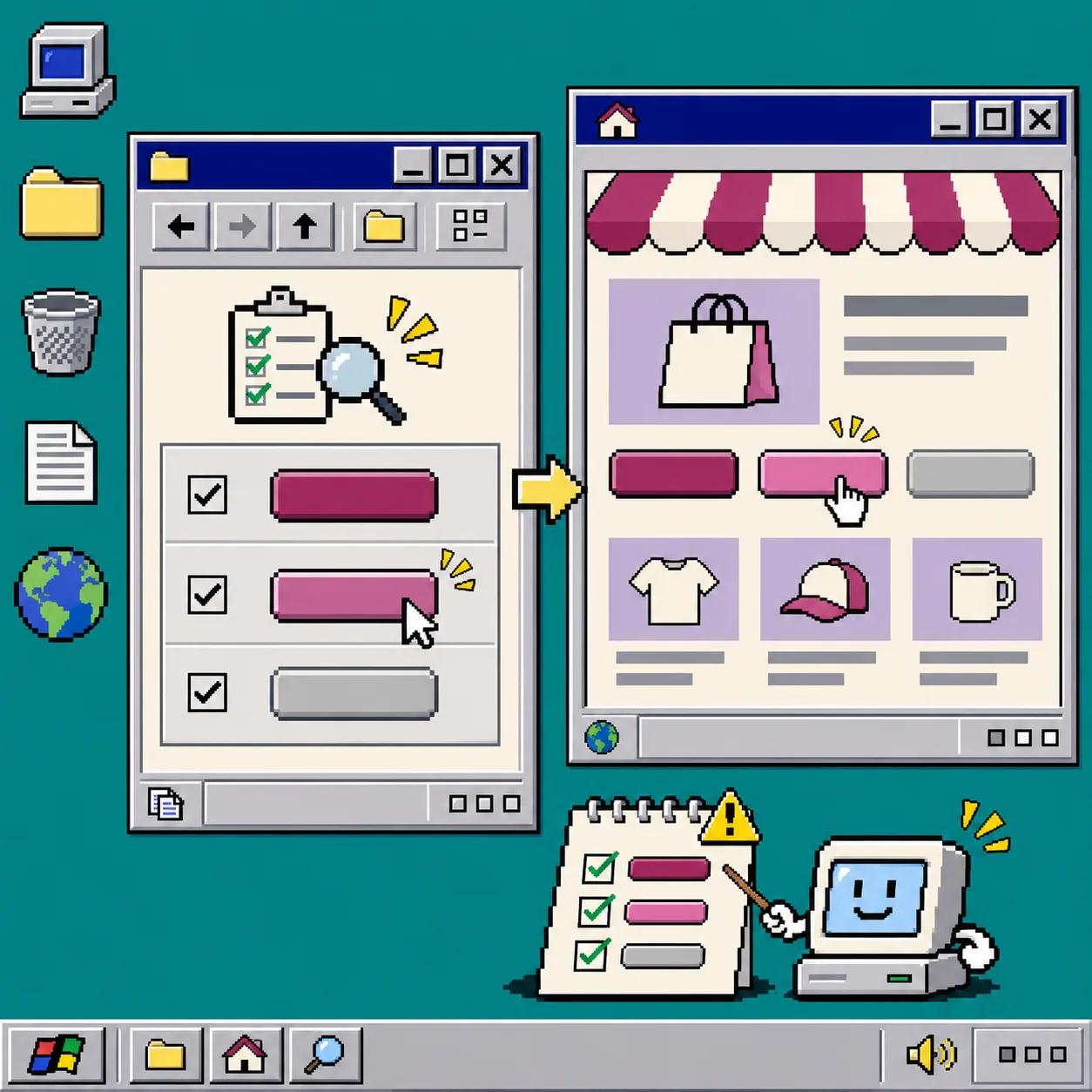
3. Check the result in a real theme preview
Return to the unpublished Shopify theme and inspect the button at its smallest expected size. Check the product page, a collection card, the cart, and any campaign section that shares the color setting. Use the preview’s mobile width as well as desktop.
Look for three practical problems the ratio alone cannot show:
- The label is technically compliant but feels cramped because the font is thin or the button is small.
- The hover or focus treatment has a different fill or label color than the default.
- The button sits on an image, gradient, or unusual section background that changes the reader’s perception of the control.
Keep keyboard focus visible as you test. A button with an accessible default color but an invisible focus outline is still a poor handoff. This is similar to the separation step in mapping product details before adding Shopify tabs: identify the visible states before you decide a setting is safe to publish.
4. Fix failures by changing one side of the pair
When a pair fails, change either the label or the fill, test again, and keep the better option in the theme draft. Changing both colors at once makes it hard to tell which adjustment solved the problem and can introduce a brand mismatch.
Use this decision rule:
- If the button background is a fixed brand color, try a lighter or darker label first.
- If the label must remain white or near-white, darken the button fill until the normal-text result passes.
- If neither option fits the design, reserve that color for a non-text decoration and choose a different action color.
Do not use the checker as a way to “approve” a color system without reviewing it. The tool itself notes that a pair can pass and still be uncomfortable at small sizes or light font weights.
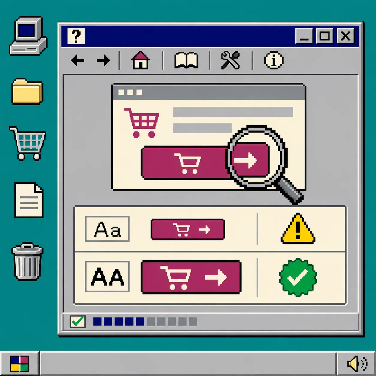
5. Run a five-minute publishing gate
Before you click publish, use this compact gate:
- Confirm that every edited default, hover, focus, disabled, and inverse state appears in your inventory.
- Record the checker’s result for each text-on-fill pair.
- Preview the smallest button on desktop and mobile.
- Tab through the page to confirm focus is visible and distinguishable.
- Publish only after the preview uses the same values you tested.
This is deliberately a small gate. It is easier to repeat than an informal “looks fine” review, and it gives the next person a clear record of what changed. If the update is part of a larger theme release, borrow the same go/no-go discipline from a draft review gate for Shopify blog automation: keep the change unpublished until the checks have a named outcome.
Troubleshooting a contrast check that looks wrong
The checker passes, but the preview looks washed out. Recheck the exact hex values copied from Shopify, then inspect font weight, opacity, and button size. The contrast tool tests colors; transparency and typography can change the visual result.
Only the hover state fails. Treat it as a separate pair. Do not assume the default state’s result carries over.
A campaign section has different colors from the theme default. Add it to the inventory and test it separately. Theme presets often create exceptions that are easy to miss in a product-page-only review.
You are changing a JSON theme setting by hand. Validate the edit before uploading or saving it. Tiny Online Tools’ JSON Validator checks syntax locally, and the companion JSON Formatter can make a compressed setting file easier to inspect. For a before-and-after comparison, use the workflow in comparing JSON files before replacing storefront configuration.
Recap
A Shopify button color change is ready to publish when every state has a tested text-and-fill pair, the normal-text threshold fits the button’s actual size, and the storefront preview still makes the action obvious. Open the Color Contrast Checker, make the inventory first, then publish the version you can explain and repeat.